 Teresa McKernan
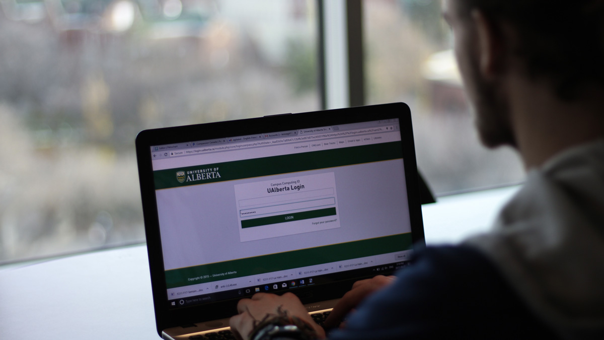
Like it or not, the University of Alberta is making us all switch from eClass to Canvas. While eClass isn’t entirely gone yet, the time to say goodbye is fast approaching. But really, which is the better option? Good-old, sometimes unreliable eClass? Or unfamiliar, new Canvas?
Canvas for the win
Canvas is significantly better than stupid eClass. The only issue lies with professors who haven’t quite mastered it yet. Though my opinion may be on the minority side of public opinion, I am unequivocally right. Canvas is the “hot” new format for post-secondary class databases. It features lovely graphics, drop-down tabs, and side tabs that actually update your progress, unlike the inferior eClass.
Glorious Canvas gives you an outline, an inbox, an updated calendar, history tabs, and beautiful formatting. What does eClass give you other than an ugly format and depression? Genuinely what is the upside for eClass? If you have ever been blessed to experience a professor who knows how to format and use Canvas like it was meant to be used, then you understand my admiration. Even the U of A recognizes that Canvas is the obvious best option! That’s why they are forcing everyone to switch to it. So don’t hate from outside of the club and jump onto the Canvas bandwagon.
Canvas isn’t the problem here, it’s people’s inability to accept change, get with the program, and use Canvas. Additionally, any of your other grievances against Canvas can be chalked up to the fact that we are all new to using the program. Of course, there will be problems with it, but those will be remedied with time.
–Julia Wadley
eClass loyalist at heart
Okay, so maybe it does all come down to disliking change. I am a creature of habit after all. But I have yet to be convinced that Canvas is any better than eClass. In fact, as me and my professors fumble through Canvas, I grow increasingly fond of eClass’ little quirks. Some may characterize eClass as outdated, but I would call it vintage. And yes, it crashes and can be a slight inconvenience at times, but that could simply be fixed with better IT support.
Canvas, on the other hand, is white, bright, and overly sanitized. Where did all the personality go? I love the colourful little icons for readings and assignments on eClass. On Canvas, there are no colourful icons, only plain, mind-numbing white. I like to have a little more colour in my life than just a green sidebar.
Plus, why would I want to have to go into a separate page to see the instructor’s notes or unit summaries? In eClass, you can see a summary of a unit right above the readings and assignments. It’s easy and simple. Maybe it does come down to a professor’s ability to format Canvas. But it shouldn’t be that hard to learn. It should be user friendly for both the professors and students. Like dependable eClass.
Maybe Canvas will grow on me with time, but for now I remain an eClass loyalist at heart.
–Leah Hennig