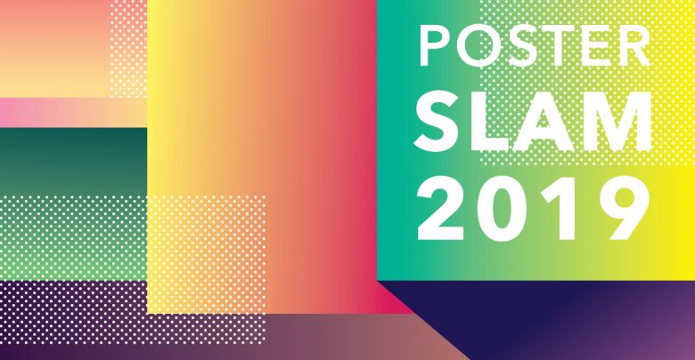
 Jessica Tang
Every year, members of the Gateway staff assemble to critique, celebrate, and comment on the campaign posters of the candidates running for SU executive and Board of Governors representative. From spacing choices to photography skills, here is the good, the bad, and the comic sans.
The Panel
Jessica Tang – Art Director
Richard Bagan – Photo Editor
Sofia Osborne – Managing Editor
Oumar Salifou – Editor-in-Chief
Victoria Chiu – Online Editor
Andrew McWhinney – Opinion Editor
President
Akanksha Bhatnagar
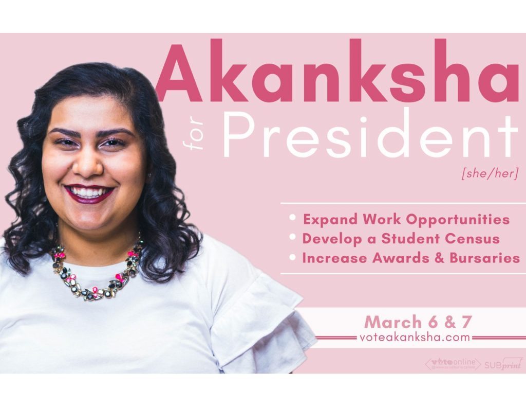
Jessica: The self-confidence and the professionalism in her photo IS NOT SHOWN IN THIS PALE, MUTED PINK! And her arm is missing, guys!
Victoria: My big gripe is actually with the bullets here. I really don’t like it when people capitalize every word in a bullet.
Sofia: With the pink, I would find it more problematic if all the other posters weren’t the same colour. At least it’s a colour that’s her own. And I feel like Akanksha is trying to lean into being one of the only female candidates and being proudly a woman, with the pink.
Jessica: She didn’t take into account the bleed for the SUBPrint logos on the physical poster.
Sofia: Disqualified.
Oumar: To be fair, she does do a really good job of putting a subliminal message in her poster by make the “for” really small. It’s like it’s saying just “Akanksha, President.”
Andrew: It’s already confirmed! You just look at the poster and you’re like “yeah, she really is.”
Andre Bourgeois
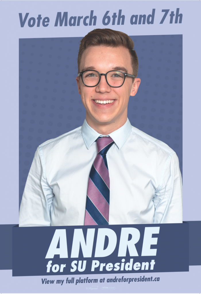
Andrew: There’s not platform points or anything, it’s just big, it’s him. It’s really playing into that populist candidate identity. But his look feels off-brand. I wanted Andre to lean more into the fun, less clean, non-politician look.
Jessica: I just don’t know what he has to offer at first glance. What makes him different than Akanksha?
Oumar: Wearing a tie, I guess.
Victoria: It’s funny that both Andre and Akanksha wore white shirts on pastel background.
Oumar: Did they run focus groups?
Richard: White shirts are in this year.
Oumar: He stands out completely from the pack. Almost everyone else’s poster could come from the same template. This one is completely original; no one is even close to this. If we had a field full of posters this original, this would be a much better Poster Slam. A much better election, to boot.
Victoria: I would say this is the best poster, but I just hate this font.
Richard: It’s looks like the most basic YouTuber font ever.
Andrew: It looks like knockoff Futura, the typeface they use for the Supreme logo.
Jessica: Guys, I noticed something. His tie is fun, it’s like off to the side.
Andrew: Oh god, he italicized his tie. Oh my god, that’s amazing!
Vice-President (Operations and Finance)
Luke Statt
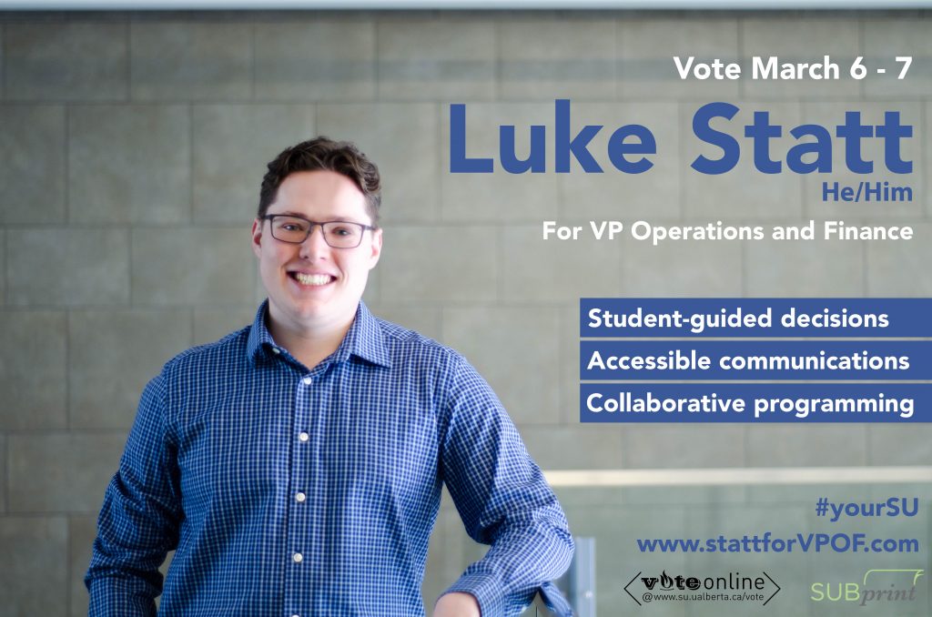
Victoria: I don’t like his actual outfit all that much. But I really like the framing of this photo.
Andrew: I feel like there’s a lot of dead space on the left.
Richard: He would have benefited from a crop on the end, and also an actual sharp photo.
Jessica: His name really doesn’t stand out against the blue.
Andrew: I haven’t really seen Luke smile in photos, but this smile, uh, it makes me a little worried about him, you know?
Oumar: This is why the other candidates haven’t been smiling like Victorian-era photos, cause otherwise they come out looking like this.
Sofia: The bullet points mean nothing. Student-guided decisions? Is that referring to the student spaces levy? Accessible communications? I don’t know what that means.
Oumar: More payphones on campus?
Sofia: These are so vague. Why even have them? Just have “this is an uncontested race.”
Richard: Luke Statt: his photo is blurry, and so is his platform.
Vice-President (External)
Adam Brown
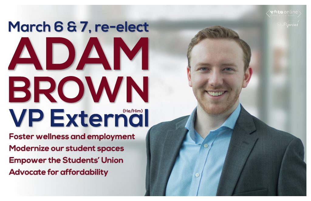
Andrew: I don’t like these colours.
Sofia: Those are literally my high school colours, I’m not kidding.
Victoria: I want to take the font gripe from Andre’s poster and put it onto this one. This is so much worse.
Jessica: This poster really annoys me cause it’s pretty much the same thing he did last year AND this colour scheme is the same as when he ran last year!
Sofia: I really like this photo. He looks the most professional. He looks friendly and nice.
Jessica: The type isn’t friendly!
Andrew: The type is haunting.
Oumar: He has the least amount of dead space on his poster.
Andrew: I don’t know, he could’ve stuck in a couple of 100 emojis around his head…
Robert Bilak
Victoria: He didn’t put his last name on the poster!
Sofia: You can only do that with known people, or people with distinct names. I don’t think of Robert Bilak as “Robert.”
Oumar: And this hashtag, are you kidding me? #voterobert? Are you the only Robert running for office ever? And the colours, there’s this weird shadow over him…
Sofia: It definitely looks like they tried to make his teeth look whiter. They look terrifyingly and unnecessarily white.
Jessica: He’s the second guy to be leaning against something.
Andrew: He looks sickly. There’s weird yellow patches on his face. The colour correction just makes him look ill.
Oumar: It looks like someone is tickling him, almost.
Jessica: There’s pixelization in his shirt! They must have stretched the image for the poster; there’s pixelization in the writing too.
Andrew: I think everything about this poster fails in what it’s trying to do. I’m sorry.
Vice-President (Student Life)
Jared Larsen

Sofia: E-A-S-E! Wait, how is he going to address deferred maintenance as VP SL?
Oumar: The real question is if “Larsen” is the first SU political family.
Sofia: “Larsen for Life?!” Is this a dictatorship?
Andrew: I mean, just look at the smile on that man. I’d let him be my dictator.
Sofia: I don’t like the students in the background doing stuff. He should’ve taken a photo in HUB. Link it to his HUB-ness.
Oumar: That person in the blue sweater is extremely distracting. They’re like an integral part of the poster.
Victoria: It’s just very disoriented-looking with the background.
Jessica: He did a good job with getting his name on there clearly, but all the extra information is just pushed all the way to the side.
Victoria: The E-A-S-E thing looks like a acrostic poem from, like, third grade.
Shuua Rizvi
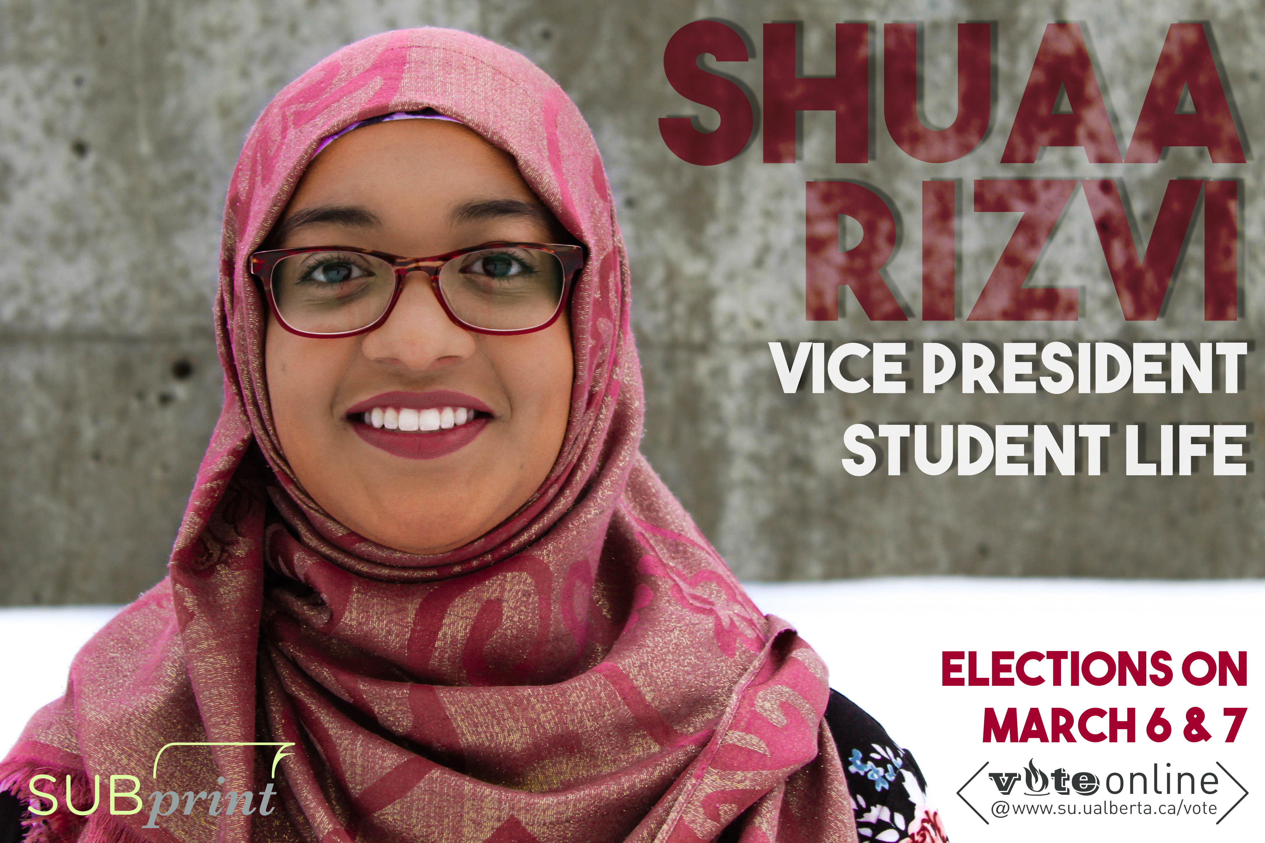
Victoria: It’s hard to see her name.
Oumar: The concrete adds such a weird texture to the lettering. It almost looks like TV static.
Sofia: I love the photo. I think she looks so good and powerful.
Andrew: The colour coordination is really competent in comparison to a lot of the other posters we’ve seen.
Jessica: This poster would have benefited from removing the background altogether. It would create even more contrast and she’d be more prominent.
Sofia: It looks like the bottom half is already gone.
Jessica: Making it all-white could’ve helped deal with the bleed as well.
Rory Storm
Andrew: This is by far the most wild shit I’ve seen in my entire life.
Sofia: I feel like he’s asking to paint my house.
Oumar: If you gave a class of grade five kids a task to design a poster, this is what you’d get.
Victoria: Do you ever miss the 90s, dude?!
Sofia: I like how everyone else is like “Andre” or “Akanksha” and he’s just “Storm.”
Oumar: Mr. Storm.
Sofia: Mr. Storm will see you now.
Andrew: I think it’s very self-aware. Given how students just don’t care about student politics, the irony just might work.
Richard: I don’t know if anyone else caught this, but the lightning bolt on his name is an NFL team logo! It’s just flipped upside down.
Victoria: Is he gonna get sued?
Oumar: Copyright, ding ding ding, get the DIE Board.
Vice-President (Academic)
Joel Agarwal
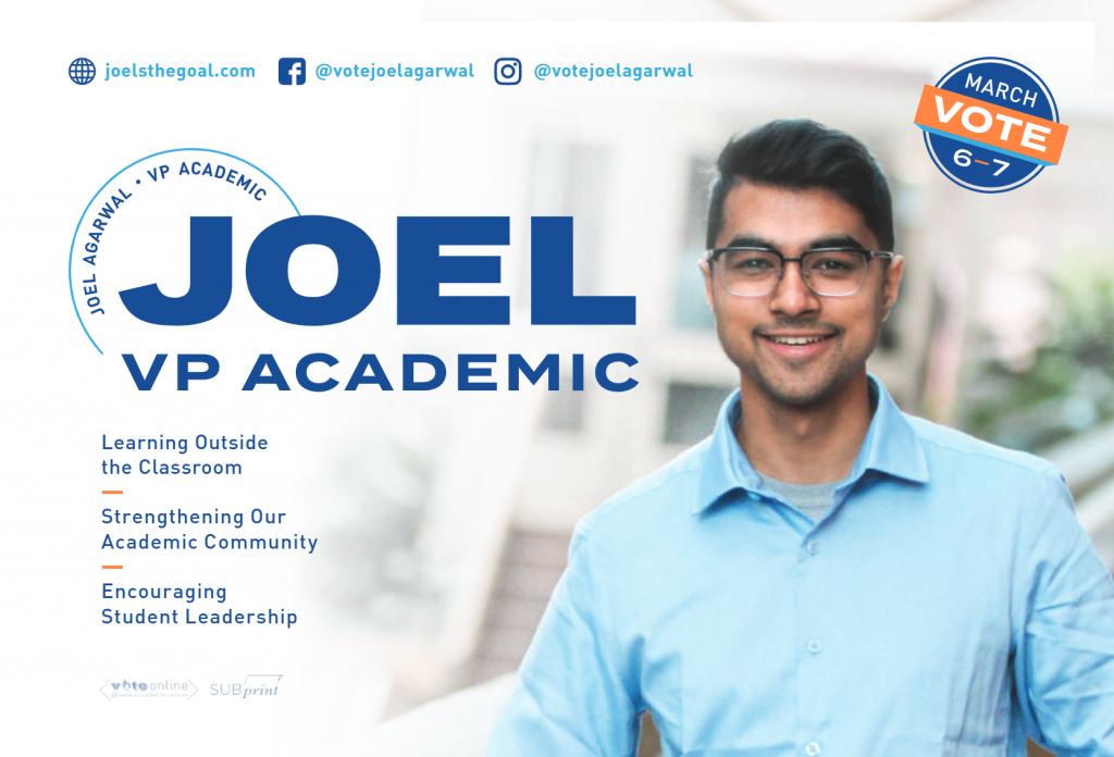
Oumar: “Learning outside the classroom.” Like when the bus driver yells at you? What the fuck does that mean?
Sofia: This is like a poster for like a volunteering opportunity in Costa Rica or something.
Jessica: That badge in the corner looks like a 100 per cent certified mark.
Andrew: I’m 100 per cent certified to vote on March 6 and 7.
Sofia: It’s taken in the Business atrium but you can barely tell! It’s so blurred out.
Jessica: I think it’s nice. It leaves just the right amount of texture.
Oumar: It would be nice if he went with a lighter blue.
Andrew: Damn, candidates have gotta stop playing it safe.
Victoria: Yeah, just put in the Chargers logo!
Plebiscites and Referendums
Student Legal Services
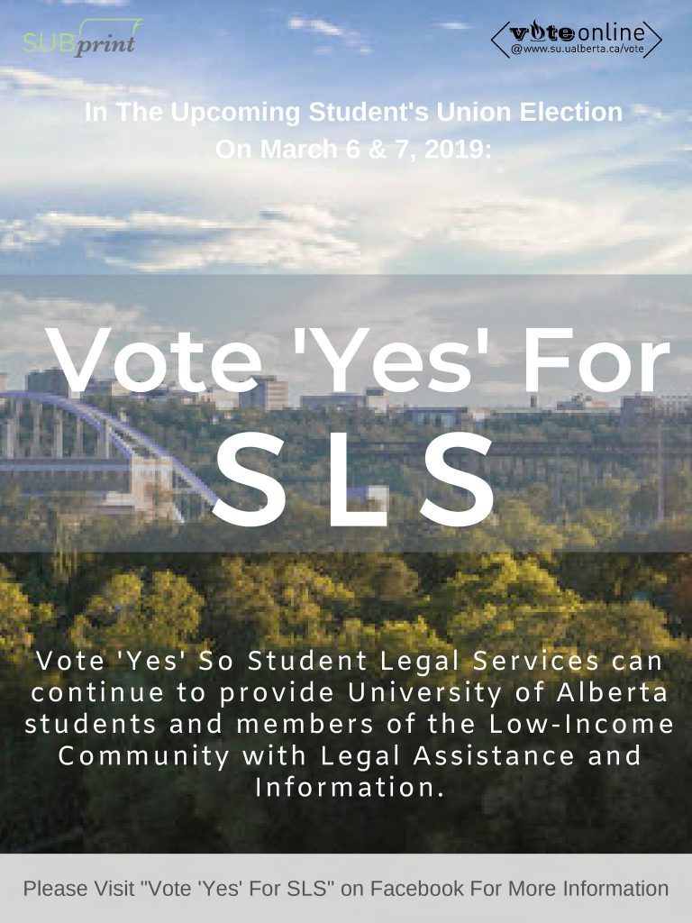
Victoria: Who proofread this?! “Student’s Union”?! That’s wrong!
Sofia: The text is unreadable on this background.
Andrew: The pixelation of this random stock photo of the Edmonton skyline is atrocious.
Oumar: It’s like a video game from 2004.
Sofia: I could have definitely given them a better picture from my phone.
Richard: Whoever made this just doesn’t care.
Sofia: I’m so disappointed because this is obviously the worst, but it’s not even a competition for the worst.
Victoria: It’s really unfortunate because Student Legal Services is very important. It’s very important to have legal information and assistance for low-income community members. They did this service such a disservice.
Andrew: Gotta say, chief, this is absolutely not it.
CJSR FM 88.5
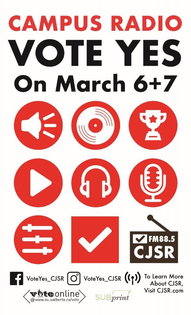
Oumar: Very clean.
Sofia: They’re smart for putting campus radio instead of CJSR because people love campus radio, but often don’t know what CJSR is.
Victoria: I really like all these little logos; they all correlate to different things.
Jessica: The square logos could’ve been in circles…
Andrew: I like the plus for the dates instead of using “and” or an ampersand.
Jess: The bottom is really messy compared to the rest of the poster.
Richard: The white background is good. Big ups to the people who do the white poster to help with the bleed.
Aboriginal Student Council
[Unavailable]
BoG Representative
Rowan Ley
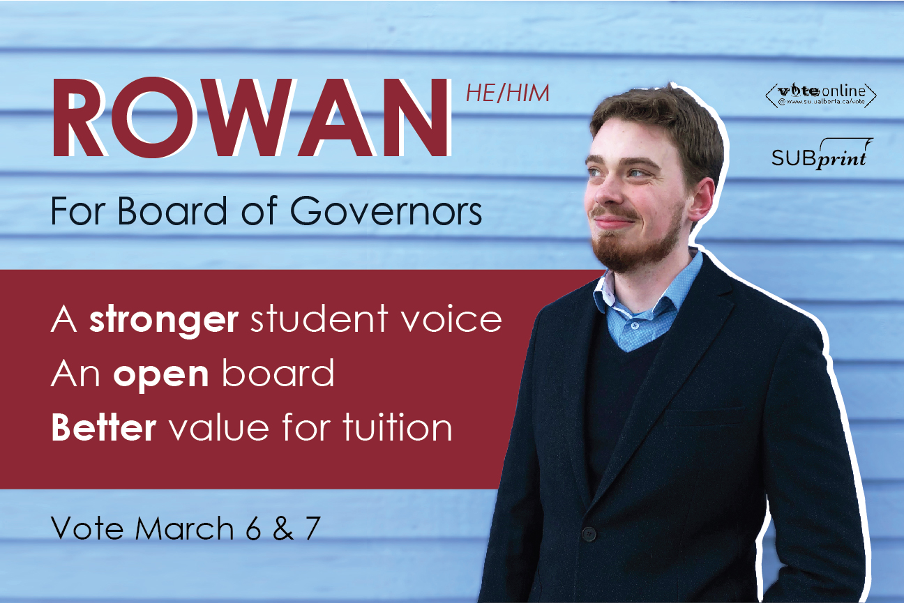
Andrew: Oh my god they cut Rowan out of a comic book and put him on a poster!
Jessica: He’s looking towards his platform points.
Andrew: He’s like, “I’m looking right at the Board of Governors and I’m going to tell them what to do.”
Sofia: Where was this photo taken?
Richard: Outside his garage.
Sofia: It feels like I’ve just moved to a small town, and I meet him, and he’s looking away from me…
Jessica: I feel this colour scheme is what Adam Brown meant to go for.
Oumar: His arm looks a little cut-off on this side.
Richard: Wait, does this mean this could be a stock background? He quite possibly could never have been standing in front of his garage.
Awards and Honorable Mentions
Best Poster: Andre Bourgeois for Cult of Personality
Most likely to take students by storm: Rory Storm for Grease Lightning
Best Candidate Lean: Andre’s tie for Sick Italics
Worst Poster: Robert Bilak for Sickly Pallor
Best Pixel Art: Student Legal Services for 8-Bit YEG
Certified 100 per cent fresh: Joel Agarwal for Voluntourism
Most likely to win VP SL: Blue sweater person for Best Photobomb