Rebranding the Oklahoma City Thunder
 Supplied
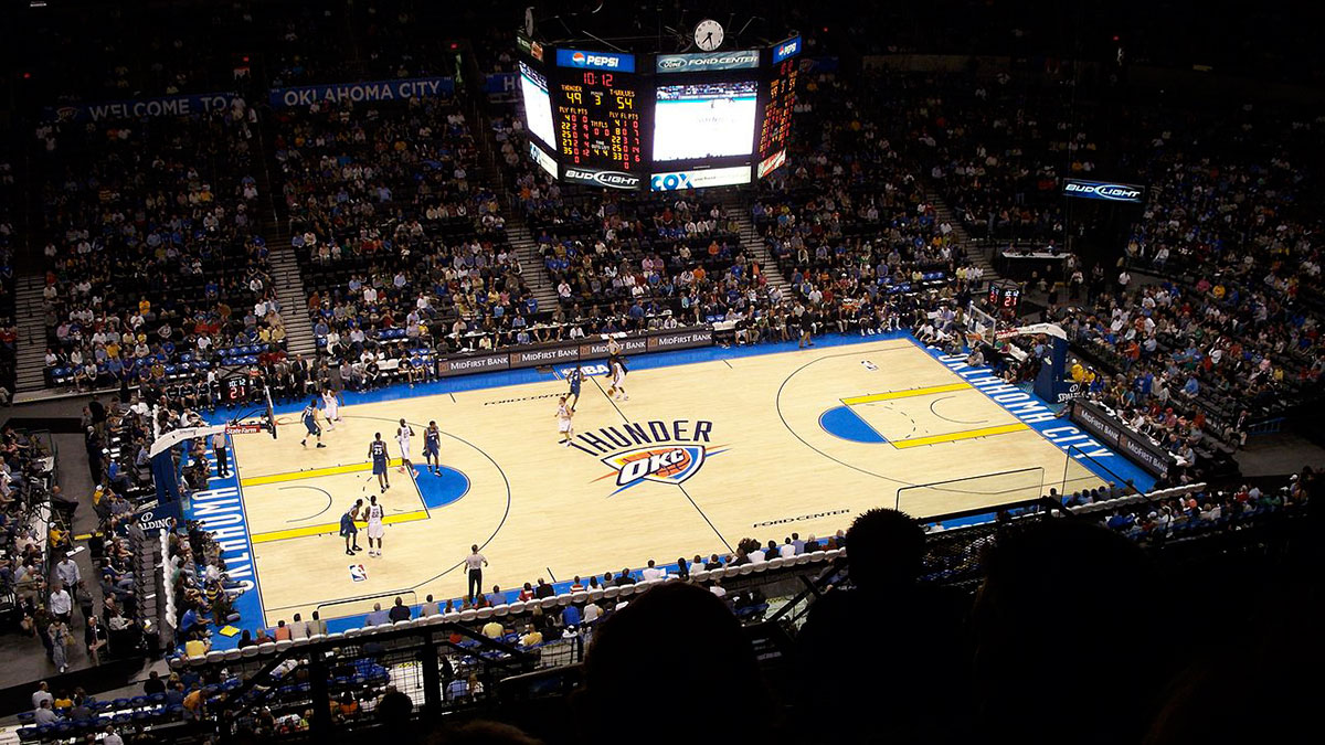
My disdain for the OKC Thunder isn’t due to a strong alliance to Seattle. Sure they deserve an NBA team, but it really wouldn’t benefit me at all. While Seattle is closer to Edmonton, going to a game has become less expensive since they moved to Oklahoma. Travel Oklahoma offers exciting travel deals such as the “Premium Tillage Package,” which includes round trip flights, use of a metal sleeping cot, and couples activities such as soil preparation for under $200. And if that’s not your speed, maybe you’ll enjoy the “Water Towers of Pottawatomie County Tour!” For under $150 enjoy full accommodation, a pamphlet on the history of water storage and a signed photo of the Water Tower from Wild, Wild West!
Look, I’m not trying to sell you on the state of Oklahoma — even though I would recommend the Water Towers Tour — I’m just making the point that traveling to Oklahoma to see a game would be both cheaper and more fun. So why does it bother me that the Supersonics were relocated? It’s the fact that they replaced a fairly iconic set of logos and jerseys with some of the most uninspired branding in league history.
Their logo feels thrown together. It was like their starting point was a shield for Kansas City and they said, “you think we can fit an O on there?” After an unsuccessful first try they went “fuck it. Good enough.” Then they threw a couple lines behind it before someone pointed out, “this kind of looks like a symbol for an OKC highway patrol” so they said “fuck it, we’ll put a basketball on it.” This all culminated with someone probably saying “I can’t believe we get paid to do this!” to which someone replied “Not for long!”
That being said, it isn’t fair to complain about their branding without actually offering up a viable alternative. And so, I present to you the 2017-18 Oklahoma City Thunder!
Primary Logo
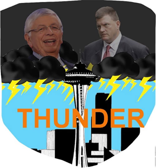
One of my favourite comics is Superman: Red Son. It explores how being raised in Russia would change Superman and the world at large. When I first saw Clay Bennett and looked at his furrowed brow, square jaw and broad shoulders I couldn’t help making a parallel. While a hypothetical this broad would be nuanced for most people, there are only two paths Bennett could take. Rise through the ranks to become a malevolent business leader, or become the greatest weightlifter of the Cold War Era. There’s no in between.
Bennett looks like the kind of guy who would celebrate boarding up an Orphanage by lifting weights at an All-Night Gym. Full disclosure, I don’t know what Bennett’s business does. But if you’re telling me he hasn’t boarded up at least ONE Orphanage in his life you’re lying to yourself.
I’ve paired this stern and terrifying figure with a jubilant and indifferent commissioner rolling in as the perfect storm. They ride in on ominous clouds, positioning themselves as GODS over the helpless city of Seattle. Not to toot my own horn, but this is a fun way to acknowledge the Thunder’s name while honouring the history of the franchise. Adding to the overall appeal is the beautiful Seattle skyline. This aesthetically pleasing featuring was the deciding factor that edged out the other logo I designed, which featured Clay Bennett choking a teenager in a flannel button down and ripped jeans.
Secondary Logo
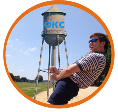
Oklahoma Knows How To Party? At least that’s what the Canterbury Choral Society suggests in their Oklahoma themed cover of California Love. And based on the fact that their Youtube video is at 100 views and counting, it seems like America agrees! With this in mind, I tried to incorporate Oklahoma’s fun side into the secondary logo while still acknowledging its proud history. Take a close look. Do you recognize it? If you said its Tower No. 5 from the “Water Towers of Pottawatomie County Tour” — you’re right!
I’ve placed this stoic Oklahoma symbol in the centre of the logo, defiantly in juxtaposition to the life of the party! Just look at the photo. You know there’s five other guys wearing the same Oakley’s, Polo combination chanting this jokers name as he pretends this Oklahoma treasure is his giant metal dick. Despite the tom-foolery Tower No. 5 loses none of its stature. It remains a symbol of hard work, patience and purity. Tying these images together is a gorgeous orange trim meant to symbolize the rising sun, presiding over the past and present as they are unified into one beautiful image.
Jerseys
Okay okay we get it! The “Water Towers of Pottawatomie County Tour” not only gives you viewing access of five historic water towers, but features an affable guide with a broad knowledge on the history of storage. And the tour’s not just informative, it’s fun. I remember our tour guide Todd climbing into Tower No. 3 and banging against the metal to show it was empty. He comes down and says, “hmmm I wonder why they call this one a WATER Tower. They should just call it……..a tower”. Well we all shared a good old fashion Oklahoma style laugh over that.
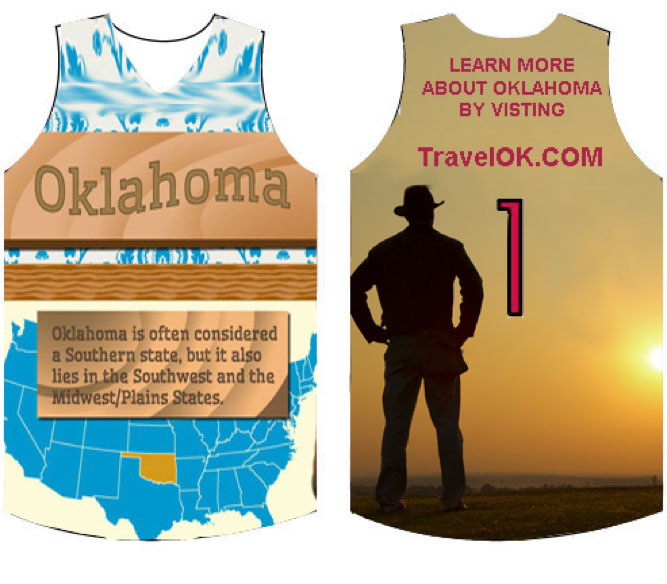
I could ramble on for days about Todd, and you’d be better off for hearing about it. But most Americans will never hear about his tours, a fact that inspired these jerseys. As you can see the back displays a cowboy gazing out over the horizon, his sight-line meeting the TravelOK website link. You’ll notice I’ve let this replace the player’s names. This isn’t by accident. The Thunder players should be reminded every time they put on their jersey what they’re really playing for. The general education of the public on all things Oklahoma. Someone turning to their spouse and saying, “hmmm did you know Muskogee has the highest density of Cider Mills to people in the Southwest?” is a real win for the Thunder.
Switching focus to the front of the jersey, I searched up Oklahoma Fun Facts and quickly pulled that image. I’ll admit, that fact doesn’t really get me pumped up about the Sooner State. It’s definitely not going to be on the final draft of the jerseys, especially with so many better options. Instead I just want you to absorb what it represents and consider these fun and interesting facts:
HOME: PICTURE: Brad Pitt enthusiastically eating a handful of dirt TEXT: Brad Pitt was born in Shawnee, Oklahoma. He returns once a year to eat a handful of Oklahoma soil as a way to honor his humble beginnings.
AWAY: PICTURE: A cop with crossed arms stopping a teenager wearing headphones. TEXT: While music has never been formally outlawed, you can incur a large fine or even jail time if you’re caught enjoying it in public.
ALTERNATIVE: PICTURE: A well-dressed man in full stride walking across the Prairie. TEXT: After a heated debate in 1919 — which culminated in Senator Robert Owen wrestling Texas representative Morris Sheppard to the ground — Owen vowed he could walk across Texas in under 12 hours to prove his claim it was a less than a tenth the size of Oklahoma.
MASCOT:
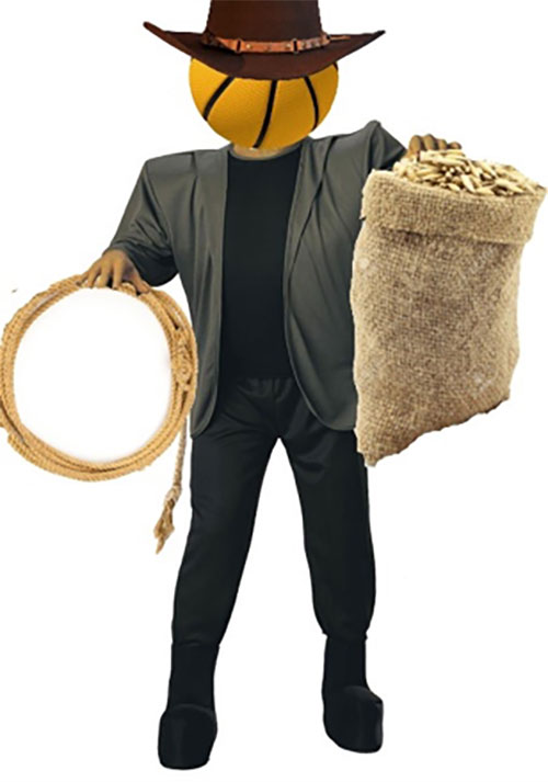
I was equally inspired and troubled by Mr. Met. On one hand he’s an incredibly unique and popular mascot. On the other hand, what exactly is he? Is he supposed to be human or a horrifying missing link of our evolution? And if he is the latter, what rights would he have in society? Would he allowed to leave the arena, or would they lock him in the batting cage between games? Does his appearance predispose an interest in baseball, or would he be like “I get it, my heads a baseball. Just once I’d like to talk about my true passion, long term accounting strategies”. I don’t know, and quite frankly it affects my enjoyment of the game thinking about it.
But for Kransoludek – aka Mr. Basketball – there aren’t such difficult questions to answer. While Mr. Met’s wide eyes and bright smile blur the lines between man and monster, the lack of facial features on the basketball head all but eliminate this issue. It’s clear, he’s science’s greatest mistake. A Basketball Frankenstein designed to reward cheering fans with handfuls of dry oats from his unmarked burlap sack. And make sure to keep an eye out for Kransoludek once he’s out of oats. Every game he’ll tie up one lucky fan and stuff them into that very sack before carrying them to THE FAN ZONE! Just try to tell me this wouldn’t improve your experience!

lol
Your a dumbass from Seattle and its very obvious in this article I can do more on a Sunday afternoon then you dream of doing on a Sunday in traffic. Fuck off and write for your own damn team.