 Alex Patterson
SU election posters have already covered every inch of brick in Humanities and Tory, tried to tempt you with campaign promises as you stand in line for Timmies, and been plastered on every cork-board in Comp Sci, CAB, and SUB. And if that wasn’t enough, giant banners of try-hard grins and alluring “vote for me” eyes stare down at you in as you try to make your way to your history lecture.
Forget Christmas, this is the most wonderful time of the year. These posters are what brings the most opinionated editors of The Gateway together. This is poster slam.
The Panel
Adaire Beatty – The Traditionalist Design Witch
Oumar Salifou – Confused Teen-Not-Teen
Jon Zilinski — Hot Puppy
Ashton Mucha — Aunty Grandma
Sam Podgurny — Fashion Streeter
Mitch Sorensen — Alternative Facts
President
Marina Banister
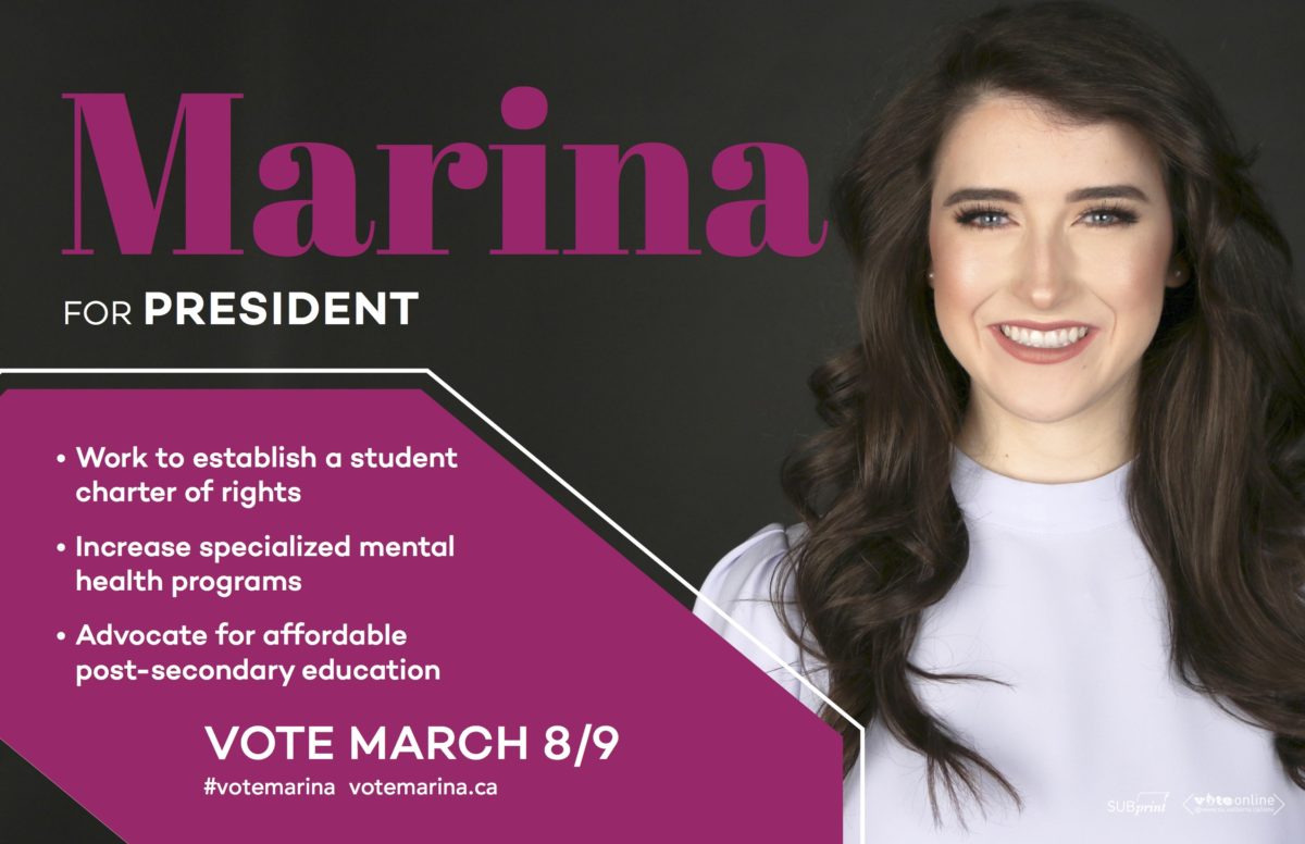
Ashton: Was Banister Consulting hired for this too?
Adaire: I want to cut out her face and tape it onto mine.
Oumar: I think we need to acknowledge this is the returning champion: the winner of last year’s best poster, and I think this is a pretty comparable job.
Sam: It’s very Sex and the City.
Ashton: And her contour is on fleek.
Mitch: Her contour is always on fleek.
Adaire: She’s got the basics: it’s Marina, it’s Marina’s face, and it’s three bullet points that are well laid out.
Mitch: The hierarchy of information is excellent here. And she’s realized that no one gives a fuck about her website unless they give a fuck about SU politics.
Adaire: This shape to me, what is this? Is it a car driving into her?
Oumar: It’s a parallelogram
Adaire: Is it a wing?
Ashton: It’s kind of like a coffin if you tilt your head. Is that symbolic?
Adaire: WELL DONE MARINA!
Bashir Mohamed
All: WOAH
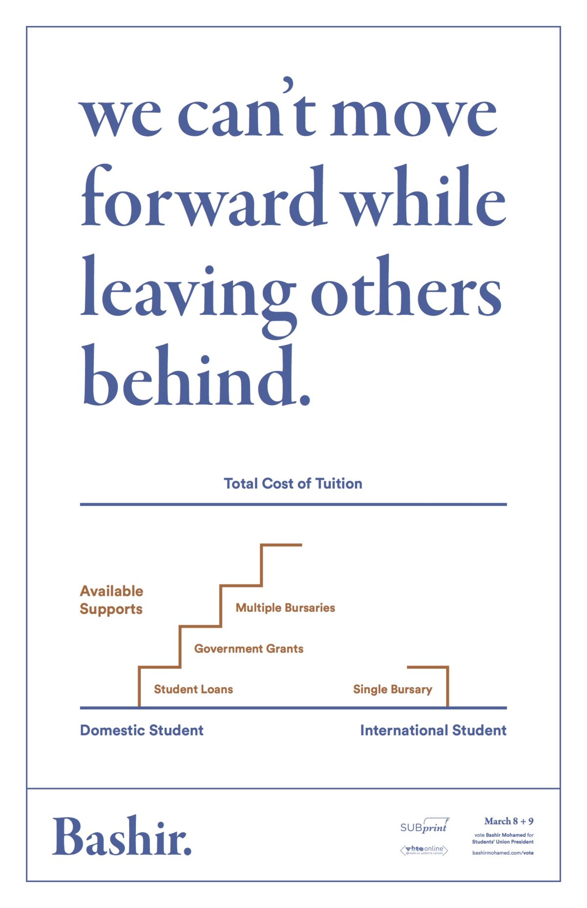
Oumar: This is a PSA.
Ashton: No last name, just Bashir. Like Madonna.
Oumar: I like this departure from using your face as the only selling point. How is your image or your nice smile actually going to make you do a good job?
Sam: Your first impression of Bashir is a blue font. How do you know this guy is running for anything? This is a pamphlet you hand out.
Adaire: This belongs in Time magazine, if he was running for president in Time magazine. This infographic isn’t very strong, there’s different ways that the information could have been presented. I kind of like the implication of stairs climbing, but then it’s implying that the international students don’t get to climb all these stairs.
Ashton: The other one is a cliff.
Sam: You graduate and you just die. At least you don’t have to fall as far if you’re an international student.
Jon: There’s way too much shit going on. We’re the U of A, we’re a public university in Alberta. Bashir’s giving students way too much credit. They want a gift card to The Ranch, not a confusing infographic in which it’s half a set of stairs.
Oumar: One thing this taps into is morality. It’s like, “I want you to feel for some random person you don’t know from China and you need to care about them.”
Sam: There’s a bit of integrity to the poster and not just a vanity project of putting these faces on them.
Mitch: Kudos for doing something different. Whether it works or not, we’ll see.
Jon: If I’m first, second, or third year, I’m voting for a cat, not a staircase.
Donut
Donut PosterOumar: That 2003 PowerPoint font.
Mitch: I can’t unsee this now. Has anyone seen that lyrics website Rap Genius? It’s annotated.
Sam: The cat is equally as serious as everyone else though. The cat should be smiling.
Adaire: I want to cut the cat’s face off and put it on Marina’s and vice versa.
Ashton: Why is it not Doughnut? Donut is lazy.
Jon: Donut the cat, Bagel the dog.
Mitch: One thing we can give Donut is the use of clip art. It’s very advantageous come SU presentations because they are chock full of clip art.
Ashton: What is the squiggly red drawing?
Jon: Pasta!
Mitch: Plate of spaghetti and meatballs.
Adaire: It’s a brain!
Oumar: What do any of these symbols have to do with anything?
Sam: There’s a purple ghost that looks like a Pacman ghost. It’s the person’s face with the brain.
Jon: Cactus.
Adaire: Atomic bomb.
Oumar: Is that teeth or a gorilla?
Adaire: There’s a cat, and there’s a hamster.
Jon: All faculties: law, pharmacy, the pizza is arts, dentistry, medicine.
Vice-President (Operations and Finance)
Robyn Paches
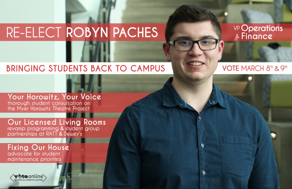
Mitch: Holy text!
Oumar: “Fixing Our House”
Jon: Like my house?
Sam and Ashton: “Welcome to my house”
Ashton: I’m glad he put “Re-elect Robyn Paches” on there for people who don’t know who he is, they’ll at least know he was in this position previously and didn’t fuck it up.
Sam: All of the people have to come up with zingy titles that mean nothing. “Your Horowitz, Your Voice” is confusing. “Our Licensed Living Rooms” is also sort of confusing. You’ve got to be straight to the point.
Oumar: My eye went to that dashing smile first.
Mitch: He looks slightly uncomfortable though.
Sam: Yeah, but that’s what he looks like all the time. I give him credit for just being himself in this poster. If you saw Robyn walking down the hallway you’d be like “oh hey that’s Robyn.” Mike Sandare isn’t monochrome irl.
Mitch: This is the first poster we’ve seen that’s shot recognizably in SUB.
Oumar: The only building you have a mandate to change on this campus is SUB, so everyone should be posing there.
Ashton: Should have taken the photo in the Myer Horowitz.
Adaire: I don’t like this font for how much text there is.
Sam: Also, if he was going with the “Re-elect” thing, he should have put on his poster the things he accomplished this term. He has an advantage that says I’ve done this. If I was to redesign the poster, it’d just be Robyn’s massive bicep getting tattooed with the Ratt logo.
Oumar: I love RATT.
Sam: My RATT!
Adaire: Robyn’s RATT!
Oumar: A vote for Robyn is a vote for Ratt.
Chen Liang
imagesAshton: I like the colour coordination here. That eggplant is very nice. He also looks very excited.
Sam: I like this guy’s eggplant though because he’s got the smile, the charm.
Ashton: That could come across completely different, “I like that guy’s eggplant.”
Mitch: Woah, woah, woah, woah. What the fuck. “Eliminate Student Fees”?
Adaire: So he wants The Undergrind to become a Starbucks?
Oumar: He wants them to make as much money as Starbucks.
Sam: “Brewery Initiative” sounds cool, like Edmonton Brewery District. He’s capitalizing pretty well. He went to a marketing class once.
Adaire: I’m getting really bored of seeing these three lines, with their three points, and the colour purple.
Sam: Yeah, but this is something you can generate in PowerPoint.
Mitch: I think he did a way better job of this poster than Robyn did.
Jon: The only thing missing is the eggplant emoji.
Ashton: He needs to be riding an eggplant emoji like Banana is riding a banana.
Adaire: OH let’s do that! Put it right under his chin, just nestle it right there under his chin.
Sam: Edit out his body, put his face on top of the eggplant, it’s perfect. Then everyone would vote for this guy.
Vice-President (External)
Reed Larsen
Reed_Update_Feb23Oumar: Another power stance. Power stance is really in this season.
Adaire: REEEEEEEED! Oh my God, Reed has come such a long way. He’s more confident in himself.
Oumar: Starbucks product placement. Does he not support the SU business of Undergrind? What the fuck bro.
Sam: It helps the lean.
Adaire: He’s come a long way with his bullet points. Although I do see a “TED”
Sam: He will not have to apologize for this poster. “TED” has a positive connotation, like TED Talk.
Adaire: The bullet points are on the side of the photo that’s darker, and the text is white, so it works. That’s really tricky to pull off because sometimes the photo starts to get really bright on the side and you’ll lose the other side.
Jon: I didn’t notice the over-exposure in that. It kind of looks like his hair is his head.
Sam: He does look a little too much like your average university instructor. No more meth.
James Thibaudeau
James' posterAll: (declining) Ohhhhh.
Oumar: Just for men.
Sam: He has both fucking buttons done up on his blazer, he’s wearing a red tie, and a black shirt, this looks like shit. To be fair, he does have the small dimple in his tie though.
Mitch: The logo is hot trash.
Sam: I saw an episode of Criminal Minds about this guy. He wrote a book on luring women with magic.
Oumar: So, he’s a pickup artist. He’s going to whip out that pick up line and I don’t know what to say.
Ashton: What about “Employability, Accessibility, OUR ABILITY”? What does that mean?
Sam: It means he has special abilities, he’s an X-Men.
Mitch: “Vote Jimmy” is a way better tagline than “Vote James.” It wasn’t James Carter who ran for president (of the United States), it was Jimmy Carter. Jimmy is much more approachable.
Adaire: The bricks are too imposing! He’s leaning out of the frame! He’s going to kiss me on the cheek and I don’t want it!
Mitch: He’s clenching the railing. White-knuckling it.
Adaire: “I won’t let you go, Jack.”
Sam: He’s approaching you for a pyramid scheme.
Oumar: I’m confident in my scam, I’m confident in your abilities.
Mitch: He’ll be a great Student Works Painting team leader.
Oumar: Toastmasters, pick-up artist club, your younger brothers’ grad.
Lisa Zhang
Poster - red version HAdaire: I think this is sweet.
Ashton: She’s looking up into the heavens for votes.
Oumar: She’s looking into her future, her destiny.
Adaire: I feel like she’s looking up at the opportunity that lies ahead, and it’s such a big space for her to fill, and she can really fill it.
Mitch: Her marketing is very specific, and that’s probably very good. This is what won William Lau the election (in 2014).
Adaire: I also like the “vote” with the check mark. They probably didn’t think of it, they took it from somewhere, but I think it’s cute.
Sam: I like the horizontal orientation.
Adaire: Normally I wouldn’t like the separation between the figure and the text, but I think because of the open space, it makes it OK. There’s breathability.
Ankur Pandey
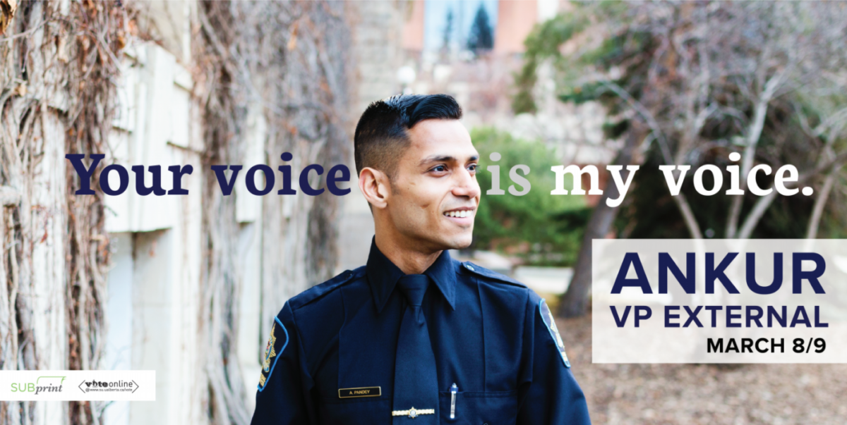
Adaire: Your voice HEAD is my voice. Your voice FACE is my voice.
Mitch: This guys’ cheekbones are fucking ridiculous.
Ashton: It looks like the voice is going in one ear and out the other. Is he really listening?
Oumar: Is he a peace officer? Police officer?
Ashton: It’s a Halloween costume.
Adaire: This poster is way less terrifying than his other one. The other one is more intimidating because he’s face on and is like “I’m gonna protect you!”
Mitch: It doesn’t talk about his platform points, but I think that could be a good thing — cramming platform points onto a poster is kind of meh.
Sam: It looks like he’s running for sheriff of the university.
Oumar: This is Alabama County. Vote for me to be your sheriff.
Sam: How do you rate his fade?
Mitch: His fade’s actually pretty good. I think he’s also wearing an Omega Speedmaster. If you’ve got that much money kicking around after tuition, props.
Sam: I also give him credit for having the cleanest tie. He’ll probably have the best tied tie.
Adaire: I think he’s a professional adult running for a student election.
Vice-President (Academic)
Shane Scott
Diverse Classrooms.compressedOumar: “Recognizing Diverse Identities in Our classrooms,” what does that mean?
Jon: There’s multicultural people.
Adaire: There’s all this white space at the bottom. They could have utilized that a bit better. But I love how happy he is. Everyone else looks somber. He’s not afraid to smile.
Sam: His capitalization is everywhere. Why is “Our” capitalized, and “in” is not capitalized.
Mitch: What you should actually do is brand yourself like RiFF RAFF and only use lower-case “i”s.
Sam: He seems as basic as the Arial font he chose to use on his poster.
Adaire: Don’t think that’s Arial …
Sam: Also, the shirt unbuttoning is actually not too bad in this case. Sometimes on certain people it looks really bad, but with the scarf it’s doing okay.
Mitch: Two buttons, that’s casual.
Sam: Does he have an untucked shirt? It’s sloppy, and it’s wrinkled too. He didn’t iron it.
Ashton: Do you think he wore a scarf because he doesn’t know how to tie a tie?
Adaire: Baby adult running for student election.
Ashton: He looks like that kid from We’re the Millers with the eyebrows!
Mitch: The brows are the exact same as Will Poulter. “Get the London Look”
Banana
BananaPosterSam: Most handsome critter. This goes to show, people who are willing to troll the Students’ Union care so much more than the people who are actually committed to working for the Students’ Union.
Ashton: This one’s my favourite because it’s ambitious and adventurous, like if Stewart Little was a hamster.
Jon: It’s the one that’s closest to a movie poster. I don’t even care what Banana’s running for, I just want to see the movie.
Mitch: This is the only memorable colour scheme. Everyone else’s is forgettable.
Adaire: “Unforgettable”
Sam: The hamster’s eyes have more life in them than any of the other candidates. And it’s relatable because he’s eating on his poster.
Mitch: Is it a he?
Adaire: She! It’s a she.
Jon: Don’t assume gender.
Adaire: I love the pattern design.
Mitch: I would put that on my wall. That’d be some fly wallpaper.
Sam: Wes Anderson’s pet running for VP Academic.
Adaire: Whoever designed this poster should apply for The Gateway next year.
Jon: If you had Donut and Banana in the same room, Donut would probably eat Banana.
Vice-President (Student Life)
Ilya Ushakov
ilya - poster 1Ashton: “ILYA” is that his name or an acronym?
Sam: It looks like an acronym. I Love Your —–
Jon: Ass
Sam: No one will vote for this guy. This is the type of poster where he’s only going to get people who know him already to vote for him.
Mitch: This guy has the Lister vote on lockdown. He’s a big deal in Lister.
Sam: It should have said, “I’m a big deal in Lister.”
Mitch: This guy looks like 95 per cent of the other white dudes on campus. I could be mistaken for this guy.
Adaire: I feel like he’s going to beat me up. He’s just sitting there, smiling in the dark.
Sam: I want someone to Photoshop him sitting on the toilet.
Mitch: He looks like he’s uncomfortable having this conversation with you.
Adaire: Why are there no last names? I’m an old woman. I’m a traditionalist!
Oumar: Kids getting rid of their last names, I don’t know what this is about!
Kyle Monda
Kyle Monda Poster Platform FinalMitch: I can’t even read those as platform points because they look like a paragraph.
Ashton: He looks timid but personable.
Mitch: That is exactly who Kyle Monda is in real life.
Oumar: He looks like a David’s Tea employee.
Adaire: The “KM” is so big it’s becoming architectural, which is going with the lines of the HUB Mall photo.
Sam: The yellow and purple are a little too old school Batman.
Mitch: LA Lakers.
Josh: Minnesota Vikings.
Adaire: I like how much he’s blurred out HUB Mall, because no one really wants to see HUB Mall.
Sam: HUB Mall has never looked better than it does here.
Oumar: There’s a rat scurrying away, a cockroach on the wall.
Mitch: It looks like he’s just smelled HoHo’s. He’s just got a big waft of whatever they’re wok-ing up.
Adaire: He looks appropriately his age.
Rabib Alam
social media revolution-12.compressedAshton: Quick! Try to make this look candid!
Mitch: When was this photo taken? This photo wasn’t taken in the last three to four months. It’s not on campus. He’s the head of the HUB Mall Students’ Association, but I don’t see that here. I’d be marketing the shit out of that if I was Rabib.
Adaire: There’s too many visuals. No red. Why is there red. There shouldn’t be red. The fence is very distracting.
Sam: The red makes all of those little logos very angry, not nice and cute.
Jon: The only thing I’ve noticed the entire time is if you put it backwards it’s MALA BIBAR.
Sam: Justin BIBAR.
Adaire: Why is displaying your wealth important when you’re running for a SU election?
Ashton: Yeah, I’d take them much more seriously if there was a photo of them emptying out their pockets and them being like “look, I’m broke as fuck cause I’m a student.”
Sam: I’m in the business school and people dress like this on the daily.
Board of Governors Representative
Mike Sandare
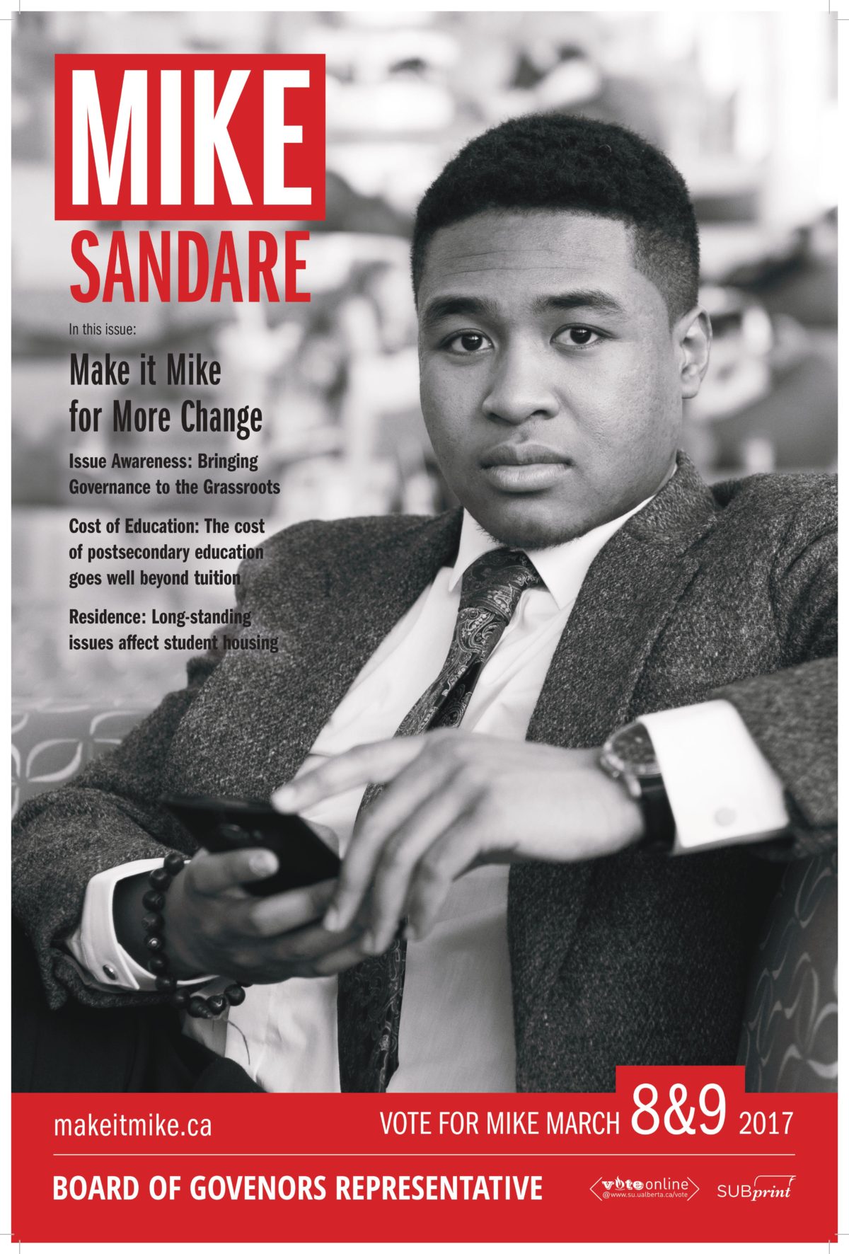
Adaire: Hot man!
Oumar: If anyone knows XXL magazine, this is what that is.
Mitch: It even says “In this issue.”
Sam: Mike Sandare has gone from boxing to boxed logos. It’s like a Supreme box logo.
Ashton: He looks like he got caught trying to slide into someone’s DMs.
Sam: Make it Mike for more change? Or make it Mike for no change?
Adaire: I think he’s auditioning for the show Ballers.
Oumar: He’s the black guy from Shark Tank. He’s wearing the same suit.
Sam: The monochrome is kind of cool at least.
Ashton: This is the face of someone who just got a D on their report card.
Mitch: He looks like he’s disappointed to see you.
Adaire: I think he looks like a toddler that someone made wear a suit
Ashton: There’s no way he tied that tie on his own. He had help for sure.
Adaire: Is there a bit of sex appeal with this?
Sam: He looks like the boss.
Armand Birk
Poster English.compressedSam: It’s bad.
Oumar: It’s basic.
Jon: I like the BIRK4BOG.
Sam: And this guy has his last name and middle initial.
Adaire: Thank you, sir. Way more respectable.
Oumar: For the traditionalists out there.
Sam: What else would you use your middle initial for? Your credit card, when you’re travelling, on your resume, passport.
Ashton: Scene card.
Adaire: What does that mean “Formalize the position”? Is it not formalized?
Ashton: “Wide range of varied experience” could that be more vague?
Sam: Is part of his range of experience that he’s worn Birkenstocks? Armand S. Birkenstock. All the white girls would vote for him.
APIRG Plebsite
“Yes” Laura Kruse
Yes_APIRG_Plebiscite_Poster.compressedJon: “Who the fuck is APIRG?” Are you serious? I don’t even like APIRG and that’s fucked up.
Oumar: Wait, this is the no side?
Jon: This is yes!?
Sam: Say yes to no APIRG.
Jon: Have you been to the Junque Cellar on Whyte Ave? It’s that.
Adaire: You’re going to give me a wrench and I’m going to make a friend!
Jon: Fun fact: you can opt out of APIRG, so just be nice and say yes and opt out if you don’t want to give them money. Don’t be a dick.
Ashton: Do people still use QR codes?
Jon: It’s just to make this poster busier. There’s so much shit going on.
Sam: This is also the worst designed poster. This poster sucks.
Jon: The fact that we had to figure out which side it was for few minutes. You first see “Who the fuck is APIRG?” It’s such a negative connotation.
Awards
Best Poster — “Best Picture Nominee” by Banana
Worst Poster — “Pickup Artist” by James Thibaudeau
Most Annoying — “Act Natural” by Rabib Alam
Best Hashtag — #BIRK4BOG by Armand Birk (second — #BANANAFORVPANANA by Banana)
Best Website — softbanana.ca by Banana
Best Lean — “Casual Eggplant Emoji” by Chen Liang
Best Purple — “Casual Eggplant Emoji” by Chen Liang
Best Contour — “Sephora VIB Rouge Member” by Marina Banister
Best Friend — “Chai Tea Latte” by Kyle Monda
Most Improved — “Starbucks” by Reed Larson
Most Likely to Take a Shit in Lister — “The Squat” by Ilya Ushakov



https://uploads.disquscdn.com/images/f2aed5857324eb0352320c88c2d8f293cb52e326298635ad89228362d412829e.jpg
Chen Liang is my dad
I love u chen.
I miss when the posters were actual garbage. Now they’re all “well, I did have time for an hour-long Lynda tutorial and learned about transparency and blurred backgrounds.” It’s a basic level of bland competence. Fully agree on the Best Poster award. Fly, lil’ hamster, I believe in you!
Love that the only award is giving to a female candidate is about how her makeup looks nice….
Banana is female. Don’t discriminate against species