 Supplied
There are a lot of arguments in The Gateway office about music. Britney or Christina? Biggie or Tupac? The College Dropout or My Beautiful Dark Twisted Fantasy? These workplace arguments are never resolved (Christina, Biggie, My Beautiful Dark Twisted Fantasy), but we never cease to get mad.
This week, our pop culture-obsessed writers are duking it out over which album had the best album art of all time.
Wish You Were Here
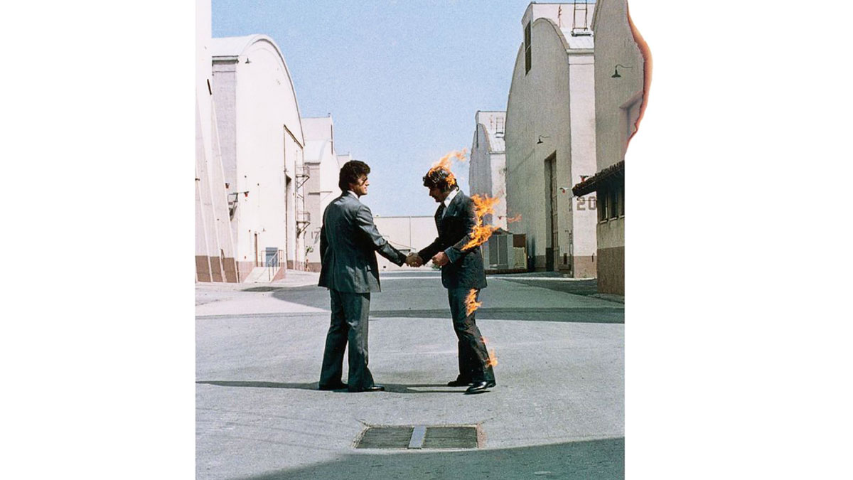
An album’s artwork must reflect the music. But why choose Wish You Were Here over the bold, iconic Dark Side of the Moon, the psychedelic colour scheme and quirk of Animals, and the soft oscillation of Meddle?
The art of Wish You Were Here reflects both the music and the story behind the album’s first song “Shine On You Crazy Diamond.” Original Pink Floyd member Syd Barrett was fired from the band in 1968 after heavy LSD use and erratic behaviour. As the band recorded Wish You Were Here in 1975, Barrett showed up unexpectedly to the studio. Barrett was overweight, bald and had shaved off his eyebrows. The band initially didn’t recognize him, but were shocked to find what had become of Barrett.
Album designer Storm Thor-gerson commented that Barrett “wasn’t really there.” Later on, many thought Barrett was schizophrenic.
The song “Shine On You Crazy Diamond” is about Pink Floyd’s former bandmate, and the album’s artwork reflects Barrett’s visit. I see Barrett as the man on fire, trying to appear normal when there is something horribly, alarmingly wrong. Barrett is a “martyr” consumed by the fire he started himself. The art hints strongly at capitalist readings — the searing irony in the lyrics of “Have a Cigar,” the selling of oneself in “Welcome to the Machine.” But the most poignant reading of the album art work, and why it’s Pink Floyd’s best album cover, depicts a former bandmate, a former friend, ravaged by time and mental illness, shining so brightly that he’s burning out. — Josh Greschner
Some Girls
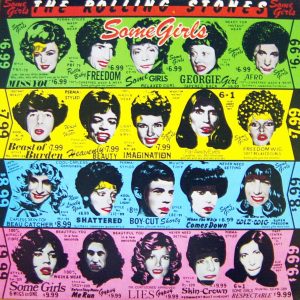
When The Rolling Stones LP, Some Girls, debuted, it showed a more serious side of the band. Straying from their usual jaunty lyrics, The Stones reinvented themselves with this record, and what better way to capture this new side of the band than with a cover that exudes the exact opposite. The Some Girls album cover is striking and colourful, and gives no indication of what the record inside holds.
What draws people to this album is the absurdity behind the cover’s photos. The cover features iconic men and women in the entertainment industry in comical way. On side 1, the record reveals men and women with goofy wigs, red lipstick and matching red pupils drawn on. Flip it around and side 2 shows the more serious side of the record with pictures in black and white, un-edited, but still with those goofy wigs. The band had often credited women as the constant theme behind all of their music, and this album cover manifests their passion in a busy, eye-catching hilarity that only The Rolling Stones could pull off. — Alyssa Cancian
Departing
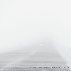
The Rural Alberta Advantage’s Departing cover depicts, upon first glance, a stark white landscape. Only after a closer look does it reveal itself to be the view of a highway mid-blizzard — a view that all Albertans know well.
Gazing out the windshield of a car making its way down a highway in the middle of a blizzard makes me feel two distinct emotions. The first is complete and utter terror of crashing. Highway speed mixed with tons of snow and heavy wind is a recipe for disaster, and being in the middle of it all is not a comforting experience.
The second thing this album cover makes me feel is a sense of escape — pairing nicely with the name of the album, Departing. There’s something about haphazardly fleeing in the middle of winter, despite the horrible conditions, that fills me with reckless abandon.
This image simultaneously terrifies and excites me, and for that reason it’s my favourite of all time. — Jason Timmons
My Name is My Name

Sometimes, simple is better. In an era where it seems that artists are going for more and more lavish covers, Pusha T was refreshingly minimalist with the cover for his album My Name is My Name. A simple white background helps accentuate the solitary bar code on the album. That’s it.
The aesthetic is awesome, and refreshingly subdued, considering a trend towards more and more flashy covers, designed to prey on impulse buyers wandering the shelves of HMV. Just kidding, I know nobody does that anymore — but seriously, I admire Pusha T’s sentiments with the cover. The album art doesn’t need to be flashy, because the music does the talking. It’s a triumph of substance over style. — Zach Borutski
Imma let you finish, but

Beyoncé had the best album art of all time. — Kieran Chrysler