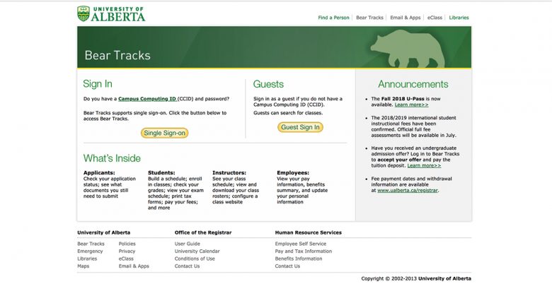
U of A students weigh in on the new BearTracks update
 Supplied
Students at the University of Alberta have said that navigating the new BearTracks has been stressful, to say the least.
The U of A launched its updated version of BearTracks, the University web portal where students can register in courses and check their transcripts, on March 2. Students described a few aspects of their enrolment process for the upcoming academic year to be fairly straightforward. However, students ultimately said the overall experience on the site was extremely frustrating, stressful, and generally painful.
Saraf Ahmed, a first year science student, spoke of her experience enrolling in classes for the upcoming Fall and Winter Semesters.
“Enrolment was very stressful,” Ahmed said. “Choosing my courses was simple but when enrolment came along the website kept crashing.”
Ahmed said she began enrolling in courses first thing on enrollment day, but didn’t get to finish enrolling until the end of the day because of how “slow” BearTracks was.
“I think [the University] should try to make enrolment less stressful so the website not working doesn’t take 10 hours out of our day,” she said.
While the process of actually enrolling was negative, Ahmed said she found no trouble in making her schedule. She found learning to use that function was “a smooth transition.” However, as a first year student this was Ahmed’s only interaction with enrolling in classes. Ahmed highlighted that she could not compare it to anything else. Ahmed said she is not certain if there was anything she could have done to avoid the lag.
“I don’t really know what I’d do differently because I thought this worked really well [at first] but then all of a sudden the website was not working,” she said.
Habiba Youssef, a third-year engineering student, described her experience enrolling in classes as “really painful.” Adding that it was especially hard because she was using her phone.
“It’s impossible to do it from your phone,” Youssef said. “It doesn’t show the entire window. No matter how much you scroll, it doesn’t show all your options at all.”
Youssef seconded Ahmed in saying that designing her course schedule was a smooth process, comparing her experience to previous years.
“I think the search process [in the updated BearTracks] is a lot smarter and that made the schedule part easier,” said Youssef. “I hated the shopping cart [in the old website], it made the everything complicated.”
Overall, however, Youssef said she preferred the previous BearTracks “way more,” and missed the familiarity of the previous version.
“[The new version] just made enrollment much longer,” she said.
Sheraz Daher, a fourth-year science student, thought her enrolment process for the upcoming academic year was “confusing” and initially “hard to navigate.” Especially when factoring in time to adjust to the new layout.
“There was too much going on with the new layout and it wasn’t as simple as the old one with just one dashboard,” Daher said.
Daher explained that she browsed courses beforehand and said she did not have any trouble enrolling in classes this year because she did it after enrolment day when the website would be less busy.
“I like to take my time enrolling in classes. Then getting on the watchlist for others, so I’m not in a rush to do it on enrollment day,” she said.
While comparing both versions of BearTracks, Daher said she preferred the old one.
“It was straightforward to use and had less buttons to press,” Daher said.
Similarly, Mishaal Sohail, a third-year business student, found her enrolment day process to be quite “easy” compared to the process in previous years.
“I was done enrolling in my fall classes 2 minutes in [on enrolment day] while it took me over an hour last year,” Sohail said.
Sohail did not think this was because BearTracks had improved this year. Instead, she attributed her success to a Virtual Private Network (VPN), which she thinks prevented the website from crashing. However, Sohail said the process of searching for courses was far more difficult.
“I hated it,” she said. “It took me a while because I couldn’t find the course catalogue. That was confusing because it wasn’t in alphabetical or ascending order. It was really hard to find what I was looking for.”
Sohail did like the shopping cart feature, however, and found it “really useful.”
“I wouldn’t have gotten into classes [while making my schedule] if it wasn’t for the shopping cart,” said Sohail.
While the new BearTracks was aesthetically “neater” and “cleaner,” Sohail said she isn’t convinced the update was worth it.
“I still prefer the old one even though I managed to finish what I needed to get done,” she said.
Kendrea Sicotte, a third-year business student, described her enrolment experience as “fine,” but like Sohail, found the process of looking for courses to be “really weird.”
“[In the old BearTracks] if you mess up one little step [while browsing for courses] you have to go all the way back and this one just automatically does it [without having to start from scratch],” Sicotte said. “[The new version] made it a lot easier for me.”
When asked which version she prefers, Sicotte said for her, the new one wins.
“I like the new one because it’s nicer to look at,” she said. “It’s not as ancient looking as the old one, and I find it easier [to use]. I didn’t have any problems like other people.”
She said ultimately it’s understandable that some students have found kinks with the new site.
“It’s [the new version’s] first year for enrolment,” Sicotte said. “It makes sense there would be issues. We just released it, so it can’t be perfect.”


