 Peter Elima
Every year, members of the Gateway staff assemble to critique, celebrate, and comment on the campaign posters of the candidates running for SU executive and Board of Governors representative. From spacing choices to photography skills, here is the good, the bad, and the comic sans.
The Panel
Ashlynn Chand – Arts Editor
Peter Elima – Art Director
Payton Ferguson – Opinion Editor
Andrew McWhinney – Editor-in-Chief
Helen Zhang – Photo Editor
President
Luke Statt
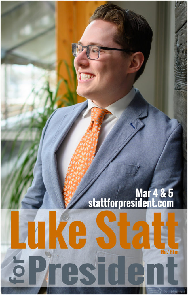
Helen: The colours just scream NDP to me.
Peter: Why is he looking to the left? He’s looking for the election gods!
Andrew: They really saturated the wood in the back to match the orange, but it’s not quite right. It’s really distracting to have that, they could have just masked out the tie separately.
Ashlynn: Or they could’ve just chosen a different tie, like why that tie? It’s a gift wrapping tie.
Andrew: Sometimes with the president, you can get away with not having platform points because it’s a very broad position, but it’s still better to have some core things that students can care about.
Payton: It just feels smarmy.
Joel Agarwal
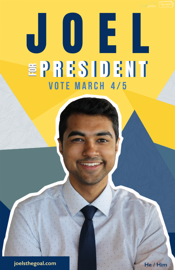
Ashlynn: It looks like a Disney channel promo!
Andrew: This Wednesday at 6:00 p.m., The Joel Show!
Helen: It reminds me of YouTube thumbnails.
Peter: Yeah, like Shane Dawson.
Payton: There’s no social media on this one either.
Andrew: This is definitely a competently-made poster, but I definitely wouldn’t say it makes me want to vote for him. It’s just kind of like, “there he is, it’s Joel.”
Ashlynn: It doesn’t feel very presidential. It feels like he’s still running for VP academic.
Payton: I would like it a lot more without the white border.
Peter: It’s like collage-y.
Yiming Chen
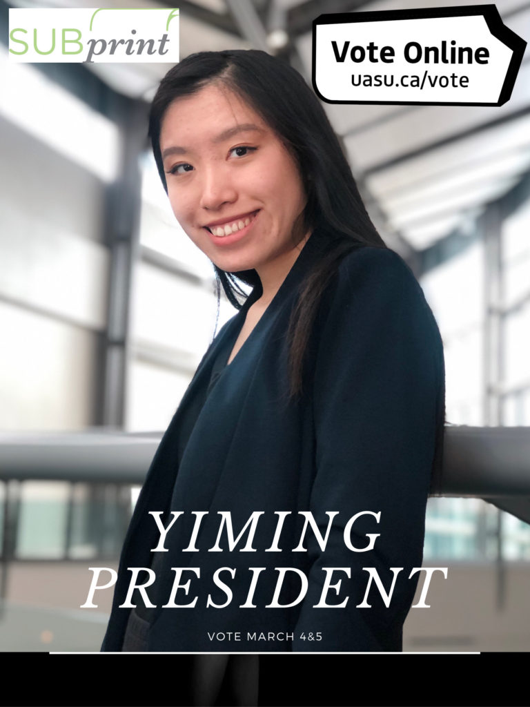
Andrew: Yiming president.
Peter: Is that her name?
Payton: Her website isn’t on there if she has one, and the SUBPrint logo is HUGE.
Peter: Who are we voting for, SUBPrint or Yiming?
Ashlynn: It feels like she just took a photo and put text on it. It just feels rushed.
Helen: It’s barely a poster.
Andrew: I feel like when she was smiling to take this photo, she was looking right behind the photographer someone was about to come out of the shadows and attack her or something.
Ashlynn: She looks like a hostage, she doesn’t want to be here.
Payton: It’s also a weird angle that the photo is taken from. Why is it taken at mid-body?
Andrew: It makes me feel uncomfortable as the viewer, like she’s looming over me.
Vice-President (Operations and Finance)
Samantha Tse
Payton: The picture is quite low-res, it looks like it got blown up definitely for the poster.
Peter: It feels like it’s from a phone camera.
Ashlynn: It feels like her friend took it or something, like “Just smile and then we’ll get it done.”
Helen: It looks very casual since she’s just at a table.
Andrew: Do people even use QR codes any more? I think they were cool for like three seconds and now nobody uses them anymore.
Payton: Overall I like the composition of hers and I like that she’s got her goals on there, but there’s too much layering going on. She’s got a layer in the top right corner and then she’s got a layer for where her name is, and the back is blurry but she’s in focus.
Andrew: I know these points have to be vague on purpose, but how vague are these? I don’t know what a student-oriented business is.
Ashlynn: It looks like an elementary school photo.
Payton: Yeah the photographer is like, “Tilt your head a little bit to the left!”
Alana Krahn
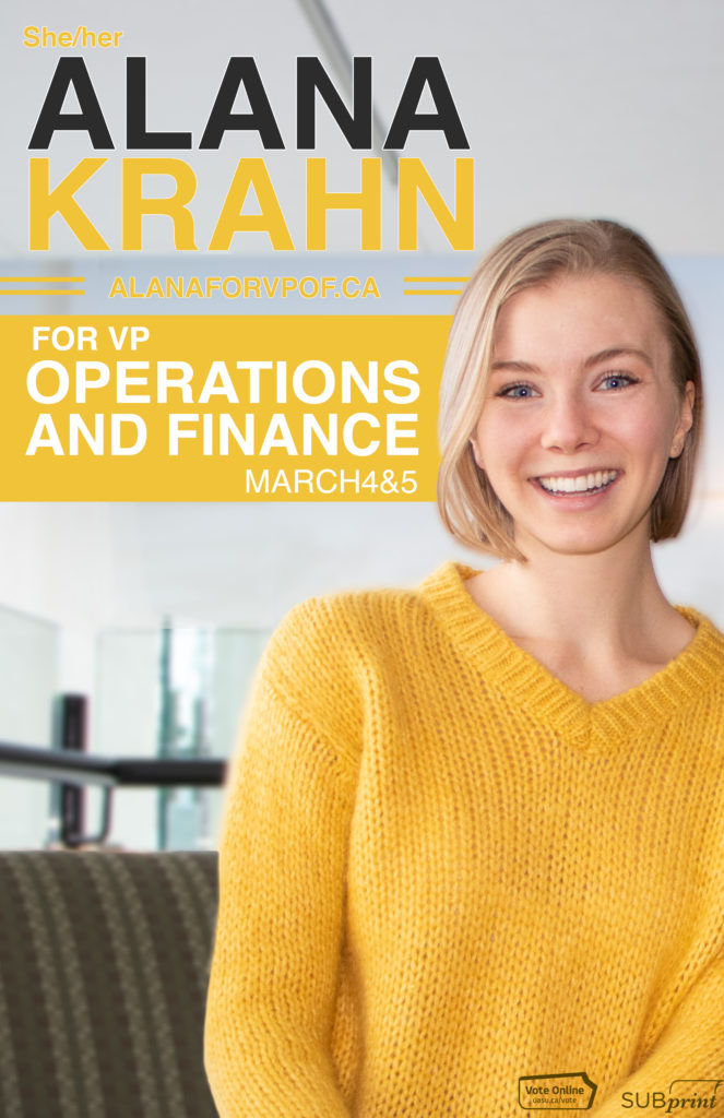
Andrew: I haven’t seen yellow used a lot, and it’s nice that it’s not the SU shade of yellow, I appreciate that.
Ashlynn: It stands out, it’s happy. It reminds me of bees.
Payton: Her picture also looks like it was taken on a phone, but with the flash.
Peter: She looks like she’s glowing.
Payton: I like that she’s off to the side, it creates nice negative space.
Andrew: If she had a bit more room to throw platform points down in this lower-left corner, it probably would’ve been an even more solid poster.
Vice-President (Academic)
David Draper
Andrew: Making lives easier? Man, I would vote for anybody who said they could make my life easier.
Ashlynn: But can he ban midterms? I don’t think so.
Andrew: I mean, with that look on his face, I think he’s pretty confident that he can.
Payton: He looks smug.
Ashlynn: I don’t like the colour scheme. His shirt matches the background too much, and then there’s random dark blues. It’s too much blue.
Andrew: It works, but the gradient is more complex than it needs to be. There was definitely a way he could’ve used more than four colours and made it way worse.
Helen: They did a really good job cutting him out.
Ashlynn: I don’t like the font, I don’t know why.
Peter: It looks like three types of Futura (the Supreme font). It’s the most basic one.
Eric Einarson
Helen: It’s soooo blurry.
Payton: And what’s with the hand position?
Andrew: I think there’s going to be magic spells or something.
Payton: He looks like a SoundCloud rapper!
Andrew: He’s about to drop the hottest mixtape in the SU’s history.
Ashlynn: I don’t think he should’ve chosen a black and white photo. It just washes him out, and it’s so dark.
Helen: Is he sitting? It’s really hard to tell.
Peter: He could be squatting.
Payton: I would love to believe he’s squatting.
Andrew: That would make this poster the best one, if he was actually squatting.
Vice-President (Student Life)
Talia Dixon
Ashlynn: I love the green.
Andrew: This is not a typical campaign picture area, so I gotta appreciate that.
Payton: Again, I don’t like the font. I like the layering on her name, but I just wish it was a cooler font.
Peter: If you know how to use a font, you can make it look good if it’s basic. I like her domains. Very simple.
Payton: She feels the most approachable I think so far, like I feel I could go up and talk to her.
Katie Kidd
Andrew: This is a poster-design lineage that’s been passed down through a couple of campaigns. It’s a prototypical SU poster, which isn’t necessarily a bad thing.
Ashlynn: She looks like a teacher, just nice.
Peter: This bit on her left shoulder is a bit awkward and weird.
Helen: It’s not totally in focus.
Andrew: I feel like I would see something like this for a federal party for Canada or something, with the colour scheme with white and one other colour. Really good use of space actually, as far as platform points.
Ashlynn: Girl power. I like the pink, women need to reclaim pink.
Andrew: I do think her website is very long. katieforvpstudentlife.com? Give me a tinyurl version of that, I live in 2020!
Vice-President (External)
Robert Bilak
Payton: I’m not a fan of the open-mouth smile. I take open-mouth smile pictures when I’m drunk, so.
Peter: I want to tighten his tie.
Ashlynn: He should’ve read our article!
Andrew: If you’re going to have platform points in a box, put bullet points beside them or something.
Payton: Why didn’t he centre the “for” between “Robert Bilak” and “VP External”?
Peter: The space between lines up with his forehead, though.
Ashlynn: I noticed the background first before I noticed him.
Payton: Yeah, green would’ve worked better on this poster than all purple.
Helen: I think so too, they could’ve pulled the colour from the windows back there.
Andrew: You shouldn’t have gone with the couch, you should’ve gone with the glass.
Rowan Ley
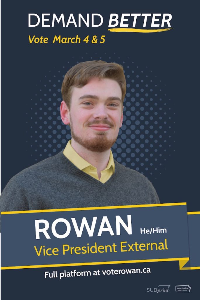
Andrew: “Demand Better.” Man, I’ve been demanding better for years, come on!
Helen: This photo is also kind of blurry.
Andrew: Everything else looks super sharp and then the photo just wasn’t. Also not the best photoshop job, but that’s probably because it was blown up. I don’t mind the colour scheme, the yellow accents are nice.
Ashlynn: This looks familiar and I don’t know why.
Helen: I don’t really know what the dots in the background are trying to accomplish.
Andrew: They would work better if he was full-facing the camera. Instead, he’s slightly off-profile and only his head is centred.
Payton: Wait, his body comes outside the colour line on the left side. What’s going on?
Andrew: Somebody missed a crop. Somebody missed a crop real bad.
Ashlynn: Someone’s getting fired.
Peter: I like vertical posters better.
Payton: Me too, I just wish the background was better. It feels like it was made in PowerPoint almost.
Peter: Was it not?
Undergraduate Board of Governors Representative
Dave Konrad
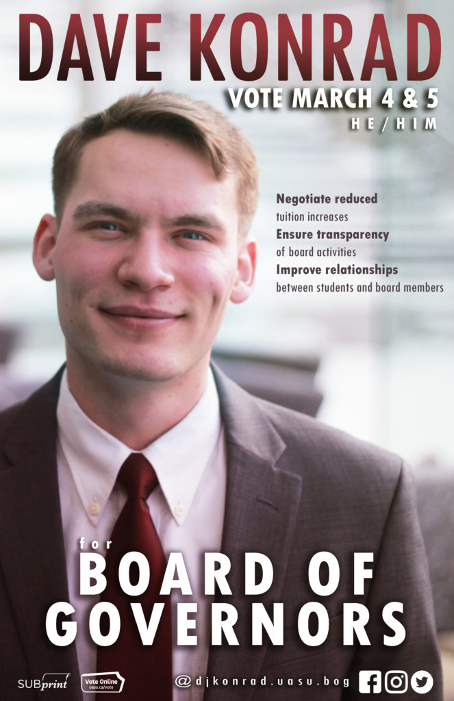
Andrew: Every time someone goes for this weird semi-burgundy red colour it never works out, please don’t do it.
Ashlynn: It’s threatening.
Payton: His picture is also so blurry.
Helen: And even his face looks too red, like maybe the rest of the red makes it stand out?
Payton: I think they shifted up the red, because look at his shirt, too!
Andrew: It’s another case of saturating a colour without masking out anything.
Peter: They really only bolded the first two words of each point?
Payton: I can understand for “ensure transparency of board activities,” because “ensure transparency” alone is a good bullet point, but “negotiate reduced” is not.
Peter: And the social media is like, “DJ Konrad!”
Andrew: Dude, we have two candidates dropping hot mixtapes this year!
Albert Hu
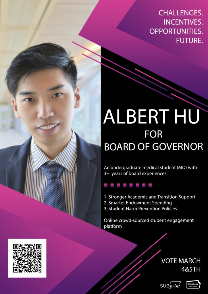
Peter: It looks like a PowerPoint.
Ashlynn: It’s like a textbook, like when you open up a textbook and there’s a little profile or something.
Payton: He put too much. Some of the people underdid their platform, he way overdid it. If you look at the points in the top right corner, I don’t like it, but that is better for a poster than what he did in the middle.
Andrew: Oh, there literally is a typo. Board of Governor. That’s unfortunate. Sorry Albert, that sucks.
Ashlynn: That’s a huge QR code.
Helen: At least there’s only one.
Payton: The picture looks good though. I think it’s one of the better pictures for the posters.
Peter: The poster kinda looks like a menu.
Andrew: It kind of reminds me of the design of a Pokémon trading card booster pack.
Referendums and Plebiscites
Golden Bears and Pandas Legacy Fund “Yes” Side
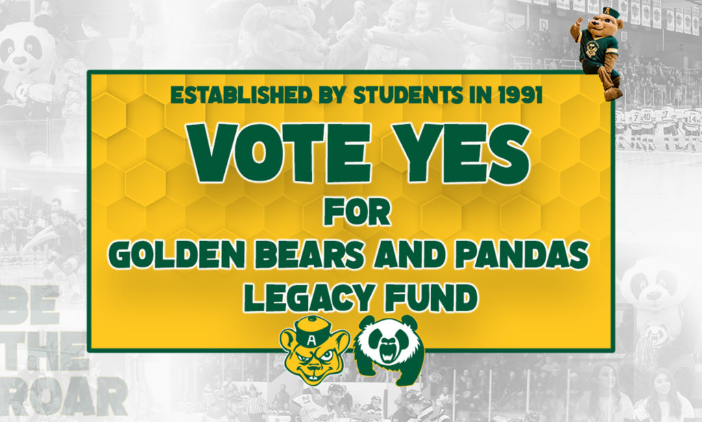
Ashlynn: What is GUBA doing!?
Andrew: I wish that this explained more. Like I’m glad that the fee was established in 1991, but what is it for?
Ashlynn: What about Patches?
Payton: Why isn’t Patches on the other side of GUBA?
Andrew: There’s Patches in the top left corner, faded into the background. Continued sexism in the mascot world.
Payton: It just looks like a kids’ poster. Like this is a poster you would see for a kids’ movie or something.
Peter: This is what Golden Bears Athletics’ ads in the magazine look like each month.
Helen: It matches the overall vibe of the Golden Bears and Pandas.
Sustainability and Capital Fund “Yes” Side
Ashlynn: This is too busy.
Helen: I think they could have just blurred the background photo, because you can still tell it’s SUB even if the photo is blurry. I also really like how they just don’t use capitals, like on “vote” or “taking leadership.”
Andrew: But of course, they capitalized the most important thing: YES!
Payton: And the stairs are wet.
Peter: Someone may slip.
Payton: Promoting unsafe conditions.
Andrew: “Greensub.ca” is an interesting one. We’re making SUB green! If I wanted to make our building green I would just buy a can of green paint and run around amok.
Ashlynn: It feels like I could make this, and I have no design skills.
Peter: You could do it in Word.
The Landing “Yes” Side
[The Landing “Yes” Side did not wish to participate in this year’s Poster Slam.]
Awards and Honourable Mentions
Best Poster: Alana Krahn for Bee Vibes
Worst Poster: Robert Bilak for Monochrome Madness
QR Code Queen: Samantha Tse for Social Oversharing
Hottest Mixtape of the Year: Eric Einarson for Rap Squat
Pokémon Master: Albert Hu for Gotta Catch ‘Em All
Biggest SUBPrint Logo: Yiming Chen for Product Placement
Hottest Disney Channel Original Series: Joel Agarwal for The Joel Show