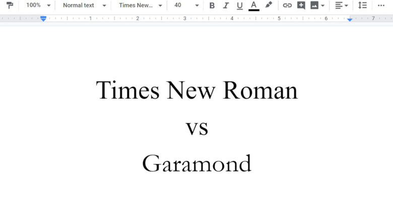
Point/Counterpoint: Times New Roman or Garamond?
It's a battle of the fonts to conquer the ages
 Helen Zhang
Times New Roman
Times New Roman has been trending upwards in the publishing world for decades now for two simple reasons: it’s easy to read, and it gets the job done. That’s not to say it’s boring; far from it, in fact. Times is as elegant as the architecture of the civilization it was named for. Times is packaged with Pages, Word, and Google Docs, because the writing world needs a standard on which to base all other fonts. Times is that standard, and continues to set the bar for fonts, all while looking stylish as hell.
This isn’t to say that Times isn’t for the upper echelons of society as well. 12 point Times is the recommended font for academic papers published under the APA citation guidelines. It’s also a staple in mathematics, where its italics have time to shine. The International Phonetic Alphabet (IPA), which is an alphabet used by linguists to demonstrate the way words are formed phonetically, is commonly written with Times. This is because a great deal of fonts don’t support the many special characters native to the IPA such as ʔ and ⇃.
The rampant use of Roboto on this very news site points directly to why readers like you need to take charge and actively demand the use of Times in your daily lives. There is a standard that must be kept in society when it comes to fonts, because without that standard, we might as well all just being using Comic Sans.
– Harmon Tamura
Garamond
Garamond is a thing of both beauty and utility. It balances the lavish strokes of the most eccentric fonts like Pacifico with the rigidness of the utilitarian choices such as Times New Roman. It is thin, elegant, artistic, and yet still understated enough for business correspondence or academic work. It’s widely used for its exceptional readability, but at the same takes up less space than other fonts. Its italic form is known to accentuate its pleasing curves without being garish. Garamond is altogether a more pleasant font for the eyes, and lends a human character to the shape of the written word.
Garamond is also a font steeped in tradition. It takes its name from Claude Garamond, a french type designer of the sixteenth century. Some versions of the font, such as EB Garamond, are his design, and others the design of Jean Jannon, which themselves are based on Garamond’s. There is not one Garamond, but many, each with slight differences noticed only by those who look for them, which only adds to its charm.
Garamond is at home with modern fonts, but brings with it the unreplicable aura of antiquity, and it commands a quiet but confident authority in its history and timelessness. Using Garamond gives just a tiny bit of that authority to your writing.
Garamond is the font of the writer, the artist, the novelist, or anyone interested in bringing some humanity to the written word. It’s also a font of tradition, of formality, and is a unique but appropriate choice for business and academia. All fonts may have their uses, but Garamond is a universal font with character. Write in Times New Roman if you really want to, but if you want more than to just fit in, Garamond should be your font of choice.
– David Spak


