 Alex Patterson
Every year members of the Gateway staff assemble to critique, celebrate, and comment on the posters of the candidates running for SU executive and Board of Governors representative. From spacing choices to photography skills, here is the good, the bad, and the comic sans.
The Panel
Alex Patterson – Art Director
Laura Lucas – Assistant Designer
Raylene Lung – Managing Editor
Jamie Sarkonak – Editor in Chief
Oumar Salifou – Online Editor
Emma Jones – Opinion Editor
President
Reed Larsen
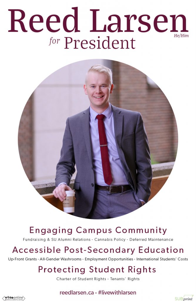
Oumar: If a computer wanted to create a poster and you made an algorithm based on the most palatable thing for the most people, this is what comes up. It looks like a poster for Olive Garden. But massive kudos for using his pronouns.
Alex: I’m enjoying these sub-headers and then the tinier sub-heads. It’s like someone having a conversation with you, and they’re telling you their platform points, and then they’re whispering platform points immediately after.
Laura: You can do colour-matching on more than just your tie. Everything doesn’t need to be red.
Alex: Hashtag live with Larsen. Live with Larsen.
Raylene: Do you want to live with Reed Larsen too?
Emma: I like that he’s carrying coffee.
Laura: But why Joe’s coffee and not the SU’s Daily Grind?
Alex: Betrayal in the ranks. At the presidential level do you really want that?
Laura: It looks like a Looney Tunes end credit.
Raylene: He looks like he’s about to sell me a $250,000 bungalow in the suburbs for my family. Two bedroom, one bath.
Shane Scott
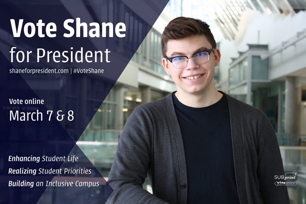
Emma: Ok for sure this is a PowerPoint template.
Laura: Even though it’s a PowerPoint template, I appreciate the angles matching with the angles of the top of the CCIS roof.
Emma: None of those platform points are things. What the fuck is enhancing student life? That’s not a sentence. Realizing student priorities? What are the priorities?
Laura: You know that Kylie Jenner thing where she’s like, “2017 is just like… the year of realizing things.”
Alex: I do appreciate that the colours are on point. A template used well.
Alex: The reflection in his glasses is kind of like a stock photo of a hacker. “I’ve entered the matrix.”
Laura: That’s his enhancing power.
Alex: That’s the light of realization.
Ilya Ushakov
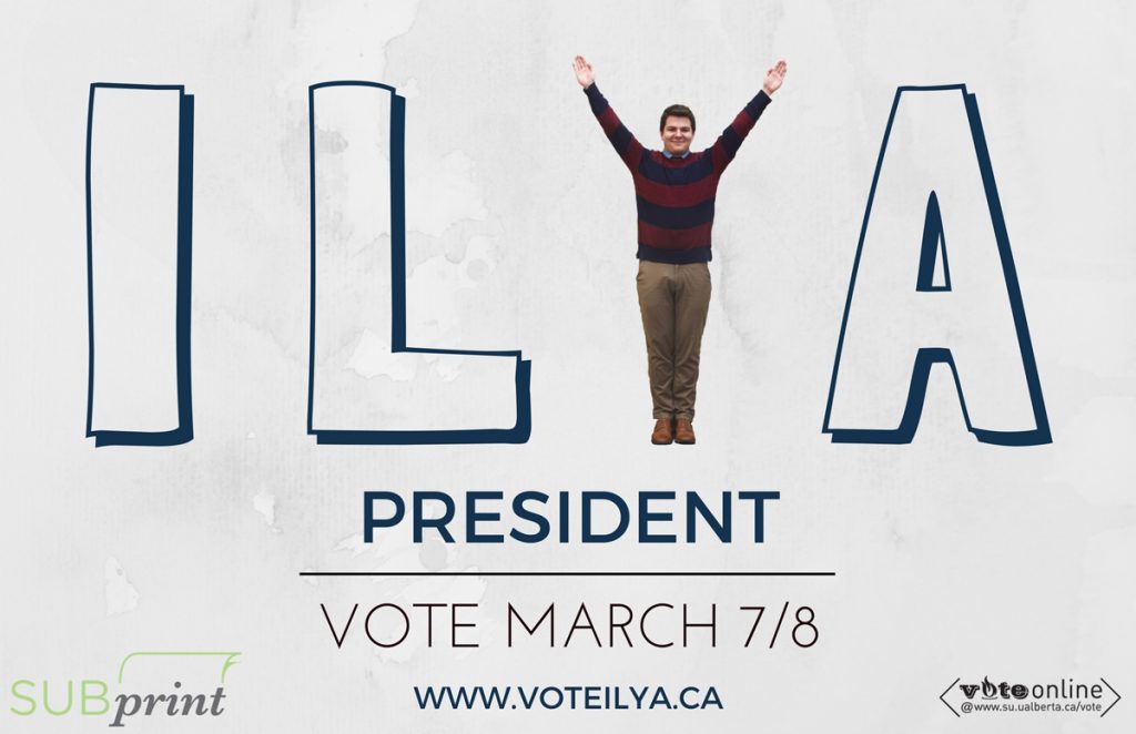
Emma: YMCA. ILYA.
Laura: This is from last year.
Raylene: Did he recreate it or did he use the same photo? Nevermind it’s unoriginal and I hate it.
Emma: No platform points. This is my body in a Y and that’s all you need to know about me.
Raylene: The Lister community is gonna go dicks out for this.
Jamie: Is it supposed to look marbled like that? Or did someone spill water on it?
Emma: It’s actually marbled like that.
Alex: He’s skipping the whole process of having his poster in Quad by having it already look water damaged.
Raylene: We’ve got no words. We’ve just got water damage and a human Y.
Oumar: It’s like a figure skating pose.
Vice-President (Operations & Finance)
Emma Ripka

Emma: It’s millennial pink!
Raylene: She’s a home flipper. She flips homes.
Alex: Love it or list it.
Oumar: Real estate!
Raylene: She works with Reed on “Love it or List it Edmonton.” She’s the interior designer and he’s the real estate agent.
Emma: Saying “effective communication” is so vague… That is not effective communication of a platform point.
Jamie: These icons are wild. They’re telling me an Egyptian hieroglyphic story.
Oumar: That beer has way too much foam on it. Who poured that shit?
Jamie: How can we trust her to enhance our bars if she doesn’t know what beer looks like?
Laura: That leaf background is just so hard to read on. There’s just so much going on in the background.
Raylene: This looks like it came out of Chatelaine magazine. It’s a good picture of her though.
JOKE CANDIDATE: Donald Stroumpf (Jessie Benoit)
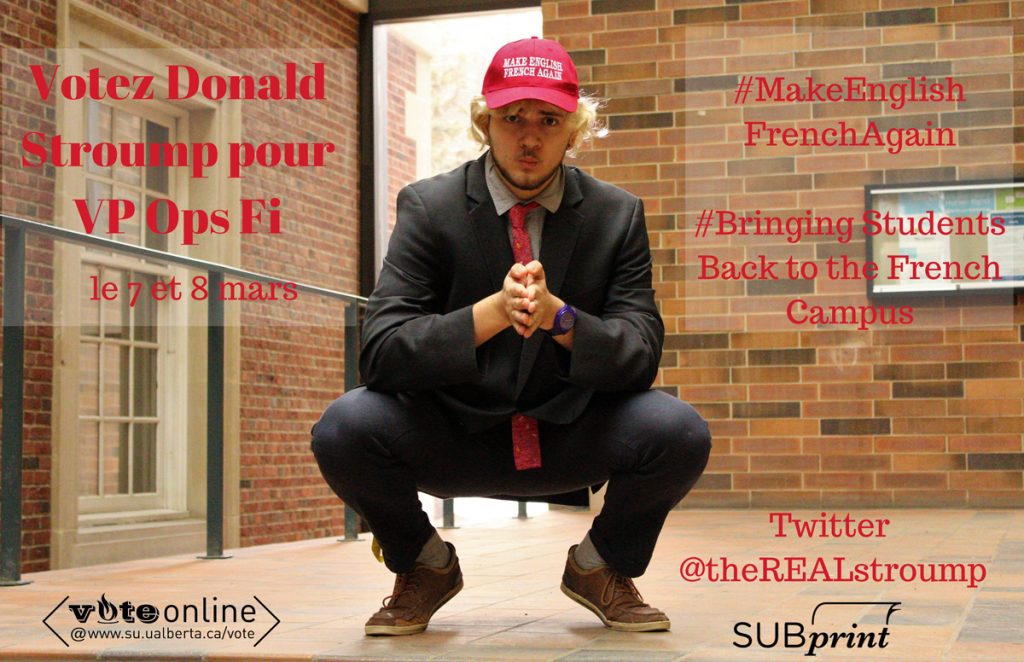
Oumar: Man. That is a poster. Stanced up. No prayer hands, we’re gonna do diagonal ones.
Emma: Power pose.
Jamie: I love this.
Laura: Anyone who uses the Trump hat and slogan, I’m immediately suspicious of. Like you couldn’t have found any other way to get your point across?
Raylene: I hate the brick. The red on the brick is just bad.
Laura: If you’re going to have two hashtags, be consistent about whether you’re going to have spaces between the words.
Alex: If the intention with joke candidates is to be bad, this is perfectly done. This is a bad poster. It’s sad that this kind of reminds me of other candidates’ posters.
Emma: It’s good satire.
Laura: Is that actually his name?
Vice-President (External)
Adam Brown
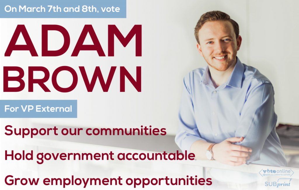
Raylene: I trust him because he has a watch.
Laura: Two text colours? Great. The boxes are a little harsh though. They’re boxing in his name.
Oumar: I’m getting religious vibes from this.
Raylene: Oh my god he looks like a youth pastor.
Emma: But one of those cool pastors who plays guitar and sings songs about Jesus.
Oumar: This is a very accessible poster though. Very easy to read.
Raylene: I trust him. I trust his poster. I trust this poster to guide me down the path of light.
Jimmy Thibaudeau
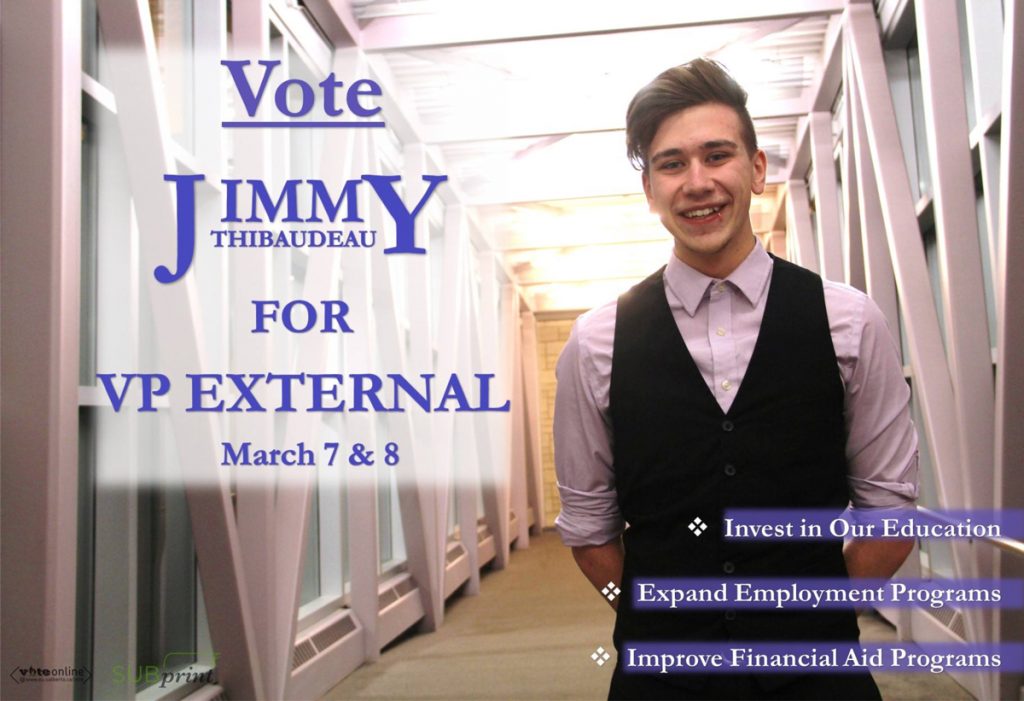
Jamie: It looks like a legal poster. Like it’s saying “if you’ve been in a car accident, we want to represent you!”
Laura: That kerning is so bad.
Alex: It looks like it’s saying “IMM Thibadeau!”
Emma: And why the white faded box? It’s coming out. It’s glowing.
Jamie: It’s like his vape haze.
Emma: It’s just so busy, I don’t know where to look.
Raylene: He looks like a valet.
Oumar: That’s why you don’t wear a vest without a jacket.
Jamie: He looks like Josh Ramsey from Marianas Trench.
Raylene: You do have to appreciate the fact that his points actually say something.
Esther Thieba
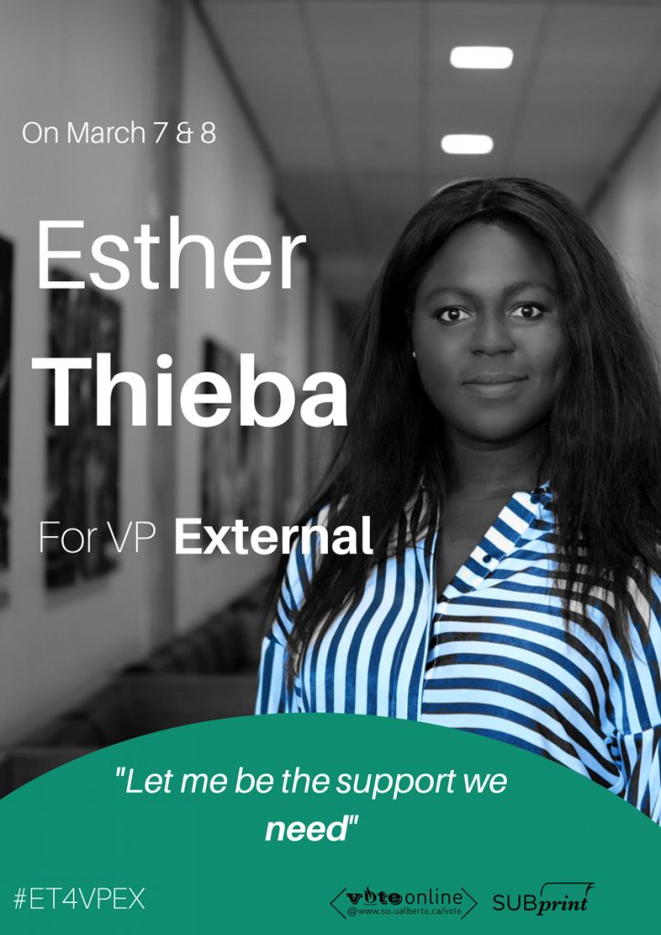
Oumar: The biggest thing with this is just usage of tint. That needs to be done with nuance.
Jamie: This reminds me of those old photos of people in the 1800s.
Laura: It looks like we’re in a staring contest.
Raylene: She’s going to stare at you until you let her be the support that you need.
Emma: Why the quotation marks? We know that you’re saying it. And why italicize? I hate that.
Laura: They don’t all align! “On” is too far over. But I do appreciate the hierarchy of her name and her title. I know that she’s running for VPX.
Emma: It looks like the hill from that standard Microsoft desktop wallpaper just arrived onto her poster and it says, “Let me be the support.”
Laura: This would’ve looked so dynamic if this was all in black and white.
Raylene: It looks like an American flag kind of.
Vice-President (Student Life)
Andre Bourgeois
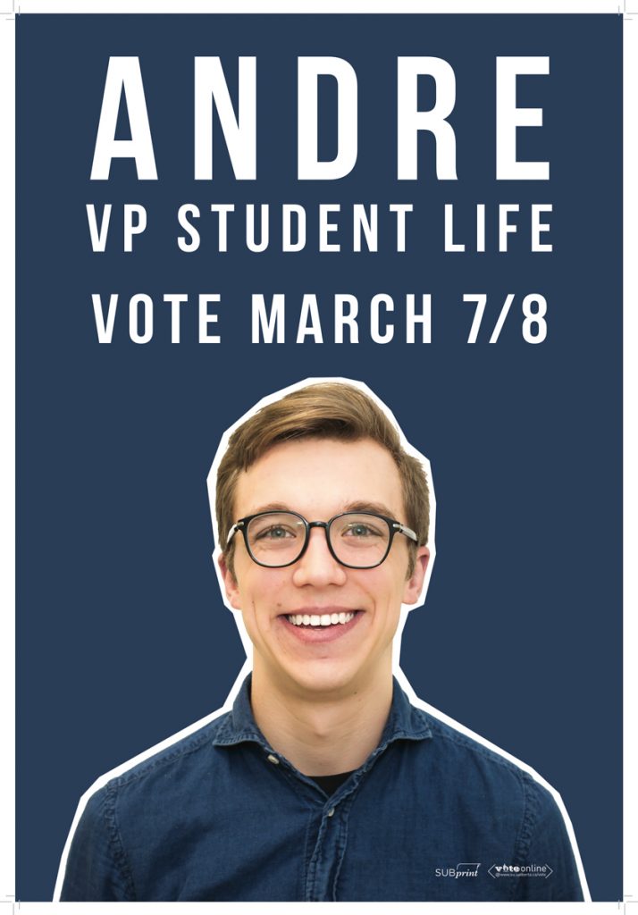
Oumar: This poster looks like a YouTube thumbnail.
Laura: He looks like a Buzzfeed person.
Jamie: Where is your platform?
Emma: I think it’s funny that his last name is Bourgeois and he chose not to include it.
Laura: I love the white outline around him. The blue on blue works this way, because you’ve broken it up enough with the white. And his hierarchy is great. If he were to have the spacing between all his lines even, it would be a fantastic poster. Also, the logos could have been centred.
Emma: He looks like a pal. He looks like he would be your buddy.
Raylene: His eyes are glistening.
Laura: He invested in his photo and it paid off.
Raylene: His teeth are amazing. I can’t stop staring at them. I would vote for him just on the fact that his teeth are nice.
Stephen Raitz
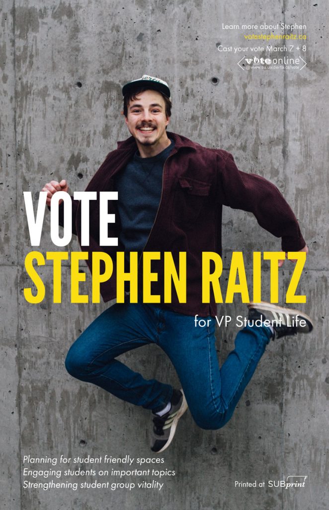
Laura: Record scratch. Freeze frame. Yup, that’s me. So you’re probably wondering how I ended up in this situation.
Raylene: This looks like a screencap from a teen 90s sitcom.
Emma: There should be a hyphen between student and friendly.
Alex: This has to be the most informative feeling poster. It definitely feels like all the information I possibly want is there.
Laura: The background is a little dark but it’s better than a white background.
Jamie: The white and the yellow look a lot like last year’s Student Union voting campaigns. So he looks more official than everyone else. That was clever.
Raylene: That gives him a jump over the competition.
Alex: The only thing is that if I were to take all the text away from this poster, I think his face would really scare me.
Jamie: He probably had to do like 15 jumps to take this.
Michelle Kim

Jamie: I can’t wait to buy her book.
Raylene: She put her pronouns! Also I’m a slut for coral so I love anything with coral.
Laura: It matches her lips well.
Emma: I really hate when people say “make a difference” because that doesn’t necessarily mean anything positive.
Raylene: It looks like an autobiography. Or a cookbook.
Laura: Her shirt is in focus but her face is not.
Oumar: If anything she probably looks the most sincere out of all of them.
Alex: Aren’t there other people who use the “Vote Michelle” hashtag? That seems like a pretty common thing.
Emma: I feel like that’s been used for getting Michelle Obama to run for office.
Oumar: I think Michelle Kim is more important than Michelle Obama.
Raylene: (Gasps) Wait a minute! It says VSPL. There’s a typo in the website. My heart just broke for Michelle Kim.
Vice-President (Academic)
Christiana Pop
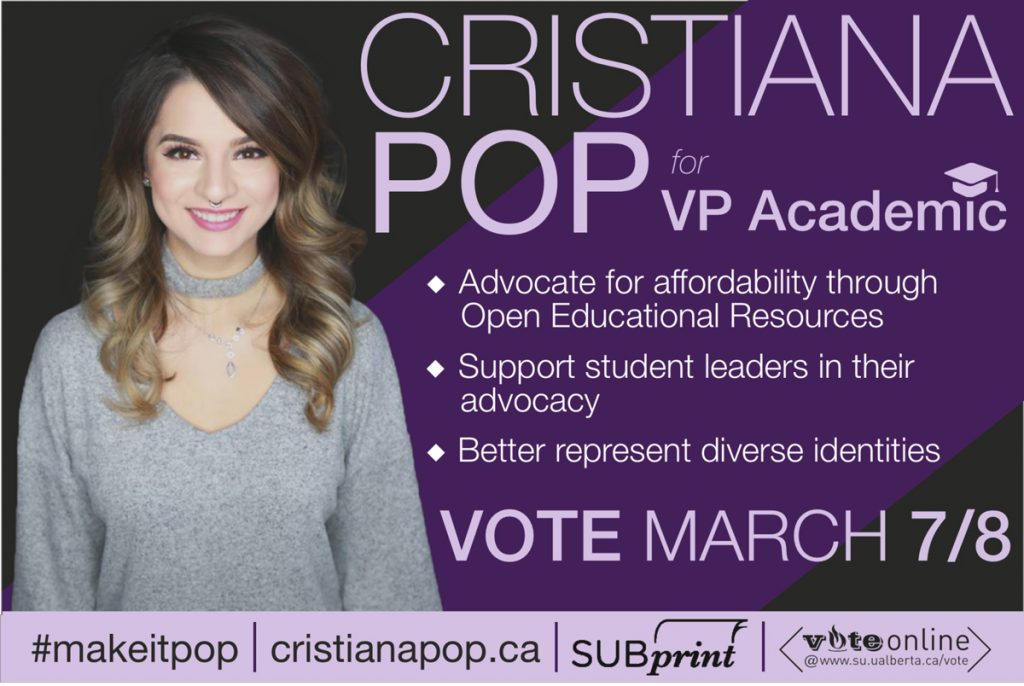
Emma: This looks just like Marina’s poster from last year. Like exactly the same.
Raylene: Her hair blends into the darkness.
Jamie: What is with purple this year?
Alex: There’s a beauty account already using this hashtag.
Emma: I actually can’t get over how similar this is to Marina’s poster.
Laura: I don’t like the grad hat over “academic.”
Emma: Two of those platform points are literally just Shane Scott’s platform points from last year.
Laura: The heavy purple bar at the bottom feels out of place.
Jamie: It’s like the feeder bar on a news show.
Alex: I appreciate that the photo is well lit. At least it’s a studio photo.
Raylene: You have to take the “pop” thing and run with it. Especially since your hashtag is “make it pop.” Which your poster does not do.
Tiffany Bruce
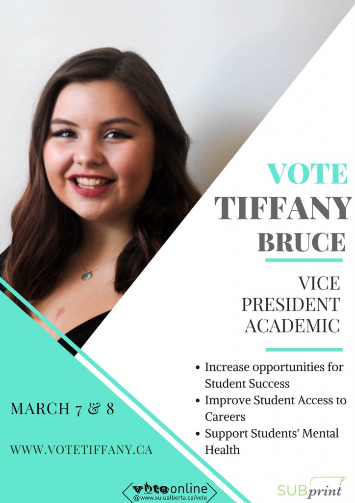
Oumar: A-squared plus B-squared equals C-squared.
Emma: Why capitalize “Student Success” and not “opportunities”?
Laura: It looks like all that white is coming up to drown her out.
Raylene: I love how her name is Tiffany and that is definitely the Tiffany blue.
Alex: This feels like when you’re at a restaurant and you see a cute person so you peek over your menu.
Oumar: That’s the grin you make.
Akanksha Bhatnagar
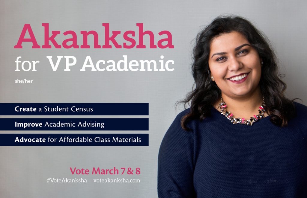
Oumar: It kind of looks like a business card.
Laura: The she/her pronouns are just kind of thrown on.
Alex: They look like an afterthought.
Laura: You can tell she had a plan of what her poster was going to look like when she got her photo taken. There was a lot of forethought.
Alex: It looks very professional. Professional but trustworthy.
Jamie: It looks damn professional.
Oumar: Simplicity. You don’t have to reinvent the wheel. It’s a fucking poster.
Plebiscite
CREF “YES” Campaign
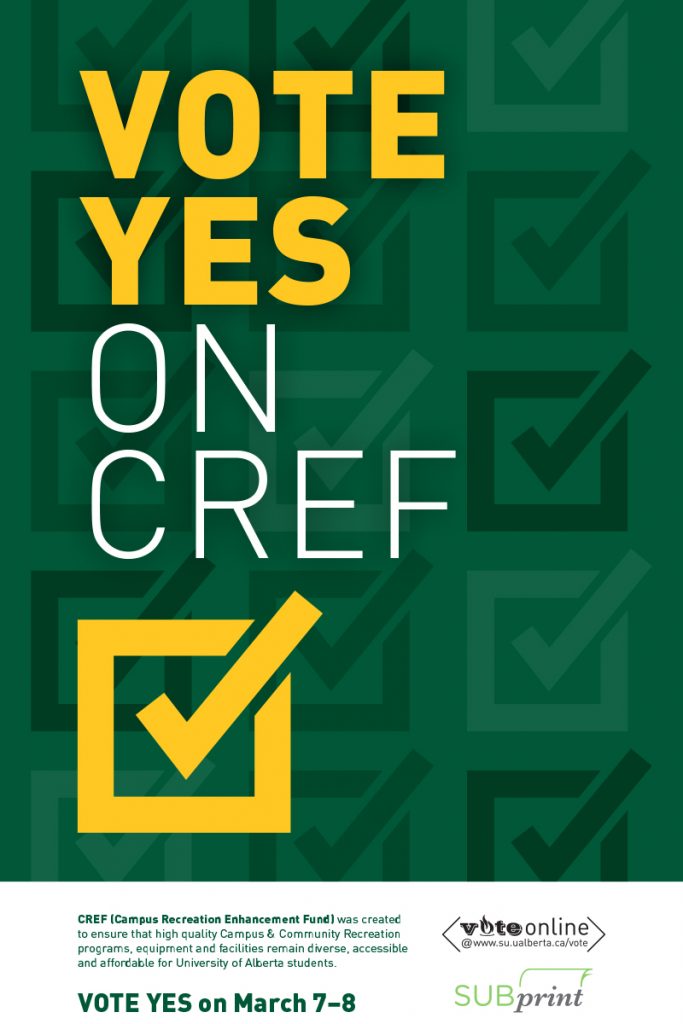
Jamie: That looks like any poster about voting ever.
Alex: I’m suddenly reminded to do my taxes and do the USRIs.
Emma: I don’t think using CREF and only explaining it in small font at the bottom is useful. Like what the fuck is CREF?
Raylene: No one knows.
Alex: Can’t Really Enjoy Fun.
Jamie: Canadian Revenue Efficiency Fund.
Alex: Campus Registration Eat Fries.
Raylene: The background should have been soccer balls or some shit. There’s nothing related to athletics there.
Emma: It looks like CREF is a tax form.
Alex: It’s so official that it feels like if I don’t vote for it, they’ll put an academic hold on my account.
Oumar: Fuck it.
Raylene: Either way I’m paying money.
Referendum
SEI “YES” Campaign
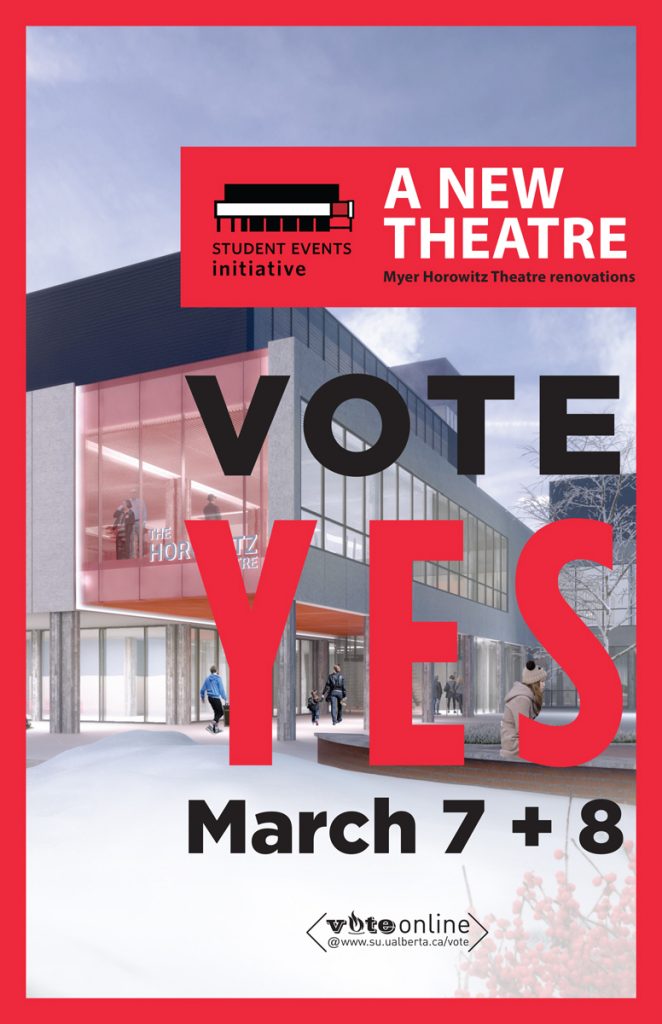
Raylene: I hate the red border.
Laura: I don’t mind the red border.
Jamie: Do you guys see this logo?
Raylene: It looks like an e-cig.
Jamie: It looks like a cigarette! They’re supporting smoking!
Laura: It looks like a piano.
Emma: It’s the Myer Horowitz!
Raylene: Ohhhh it’s a building.
Alex: I thought it was the top of a doctor’s office scale.
Jamie: Next time the SU designs something they should really consider if it looks like a cigarette or not.
Alex: Literally The Flame.
BoG Representative
Yiming Chen
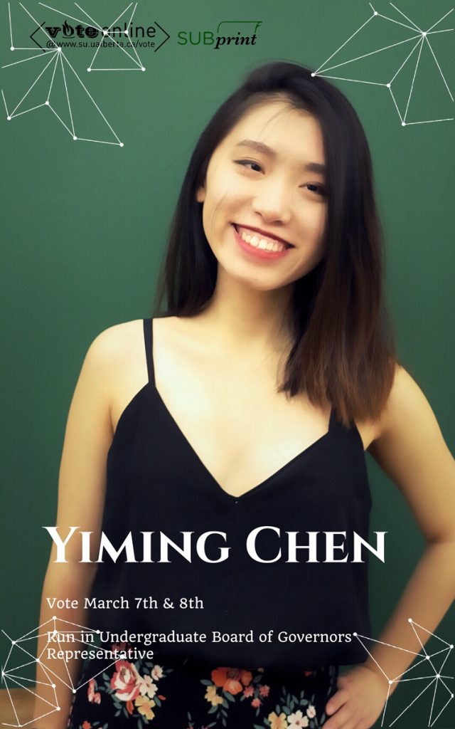
Jamie: It looks like she has an Etsy shop.
Laura: She face-tuned out this strand of hair but not all the way, because you still see it on her forehead and her cheek but not over her eye.
Emma: Also “run in undergraduate” suggests that she wants you to run for BoG rep, not her. I don’t really want to be the BoG rep.
Raylene: Bad grammar.
Jamie: Someone has to copy edit posters.
Laura: And the weird geometric things? I wish she’d pulled in flowers to go with her shirt instead.
Emma: The geometric things overlap the text and that bothers me.
Oumar: It would be better if she just took out the geometric things.
Alex: The intention was there, it feels heartfelt, but it could have been done better.
Levi Flaman
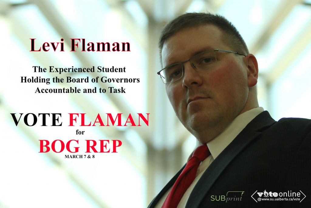
Oumar: That’s the look your stepfather gives you.
Emma: This is “I’m not mad, I’m just disappointed.”
Laura: Did he colour-drop the red from his tie or his cheeks?
Emma: The words are so chunky and repetitive, and why capitalize all of them? It’s a poster, it’s okay.
Raylene: He’s staring at me right now. I’m nervous.
Laura: Why is his name black but outlined in red?
Emma: It looks like this was made in Microsoft Word.
Raylene: I think that’s Times New Roman.
Alex: First years will be like, “Why is the principal from my high school the BoG rep?”
Awards and Honourable Mentions
Best Poster: Stephen Raitz for 90s Sitcom Man
Best Channel to Like, Comment, and Subscribe: Andre Bourgeois for YouTube Vlogger
Worst Poster: Levi Flaman for Disappointed Dad
Most Biblical: Adam Brown for Jesus is Cool
Most Likely to Become a Reality TV Real-Estate Duo: Reed Larsen & Emma Ripka for Love it or List it Edmonton
Most Pro-Smoking: SEI “Yes” Campaign for Light Em Up
Best Cookbook: Michelle Kim for 365 Ways to Cook Asparagus

